Quick Tips in Design
Part 6: Color Science
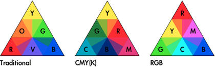
As art and science progressed, techniques for using color were developed into reliable systems. Color wheels, based on the colors red, yellow, and blue, were created by Newton in 1666, Mayer in 1755, and Harris and Gainsborough in 1788. By the 19th century, advancements in chemistry and chemical processes developed into manufacturing improvements for color pigments, which led to greater availability and consistency of paint color and more precise discussions about color. In 1839 Chevreul, a chemist and carpet dyer, combined art and his science background to create the completed traditional color wheel discussed in part two of this series, Using Color.
There are differences between color theory and color science. Color theory uses generalizations that can used throughout different media to create aesthetically pleasing results. What science has accomplished, using traditional color theory in the arts as a starting point, is a more objective and exact description of color that can be used for consistent reproduction and color mixing. Scientific color principles are very important because they are the basis for how visual art and design can be reproduced for mass communication.
The science of color (and some other scientific discoveries as well) developed from art, and eventually surpassed the limitations of artistic color descriptions. Unfortunately science continued using art terms and adapted the definitions to fit the science, all while some artists continued with traditional methods. This co-development has lead to a great deal of confusion and debate.
Understanding how to apply both traditional color theory and the science of color equips the visual artist with more tools to create and communicate. The traditional color theories still work very well when actually creating visual art instead of just reproducing it, but it is also important to know color science. Color science is what is used by computers for viewing, creating, and printing images, as well as the mass reproduction of visual imagery in print and video.
There are two types of color, additive and subtractive. Additive color is emitted from a light source, such as the sun, a light bulb, or a television set. Subtractive color is reflected light, the color of an object like the green of grass.
Additive Color and the RGB Process
The 20th century brought readily available electric power and abundant artificial lighting. These technologies were necessary for advances in the scientific understanding of color. Additive color is how light is mixed to create color. Every time additive color is mentioned, think of the world “light.” The most common method used to explain additive color mixing is the flashlight model.
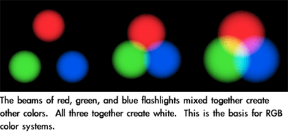
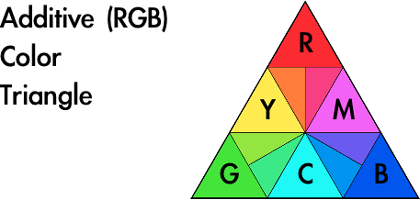
This method is called the RGB (red-green-blue) process because those are the primary colors used to mix visible light. This is the color system used by televisions, computers, color CRTs, LCDs, plasma screens, stadium mega-screens, and stage lighting.
Mixing equal amounts of all three RGB primaries together will create grays or white depending on how much light is added. Black results from the absence of all light.
Of all of the color mixing methods, RGB is the most accurate and most versatile. The color seen is a product of light and is coming straight from the source. Additive color doesn’t rely upon the reflection of light off of objects to reach the eye and isn’t affected by the reflective surface as with subtractive color. Additive color is not changed by glossiness, scratches, dirt, or other material textures because it is coming from the light source into the viewer’s eye without interference.
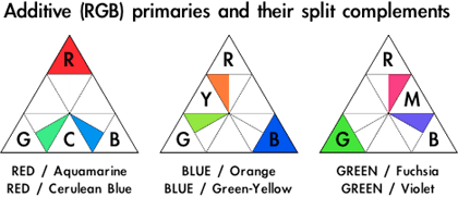
The terms Additive Color, RGB, and Light are often used interchangeably. For example “Light Complements,” “RGB Complements,” and “Additive Color Complements” all refer to the same thing.
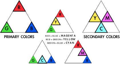
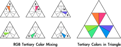
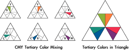
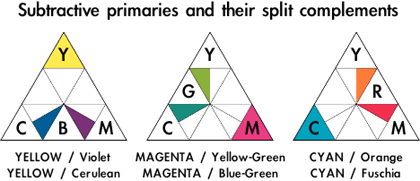
The secondary colors of light are cyan, magenta, and yellow (CMY). The tertiary colors are created by mixing equal amounts of a primary and adjoining secondary color.
Just as with the subtractive (traditional) color system, the complements of the primaries can be found directly opposite on the color triangle. As with the traditional complements, the modern complements create a visual energy when used alongside one another. The similarity between the traditional aesthetic definition of complements and the science ends there.

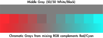
The modern complements balance each other by canceling each other out, meaning when equal amounts of color are mixed they create gray. This gray and its shades toward each of the colors are called chromatic grays. This principle does not work with traditional complements, since they define a system of subjective color usage explaining psychological effects and the interaction of the colors. When mixed, the traditional complements produce a “brownish” color that has hues of the colors used to create it. Don’t confuse the two systems, even though they share terminology.
The completed RGB color triangle shows the basics of color mixing using light. The actual colors can only be viewed on an RGB device or projected from a light source.
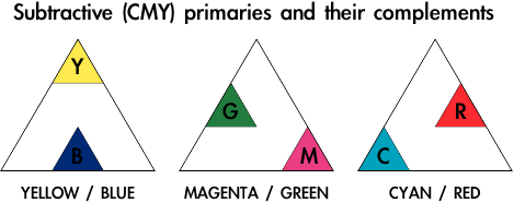
Subtractive Color and the CMY(K) Process
A problem with traditional color theory is that while RYB (the traditional red-yellow-blue primary colors) color mixing creates aesthetically pleasing results, it will not create every color necessary for mechanical reproduction of photographs and other “full color” images. This is because red, yellow, and blue are not the true primaries of color. Traditional color theory is effective for art, but it is subjective and not well suited for the science and technology needed for mass media.
While the understanding of additive color was growing, many people worked on methods for efficient and consistent color image reproduction. This eventually lead to the defined cyan, magenta, and yellow (CMY) color process, used today in most color reproduction from large printing presses to inkjet printers.
The science of subtractive color can be a little confusing. When we say that grass is green, it really isn’t. When white light hits the grass, all of the other colors of light are absorbed by the grass but the green light reflects. We see green grass because that is the only color of light left to bounce off the grass and into our eyes. Even though we say grass is green, in reality grass is every other color but green. This is why the color of objects is called subtractive.

The additive secondary colors, cyan, magenta, and yellow, which are also the complements to the RGB primaries, are the subtractive primary colors. As with additive color, the CMY primaries can be mixed in exact amounts to create any color. When all three RYB primaries are mixed together they create gray or white, but when CMY primaries are mixed together they create gray or black depending on how much of all three are mixed. As with RGB complementary color mixing, the subtractive complements can be mixed with each other to create chromatic grays.
In real world applications such as with inkjet printers, the black created by mixing CMY together is not as dark as black ink because the optimal inks for printing the best color are not the best for creating black. The result is usually a dark gray. It is also less efficient to use three inks to create black, especially for type and B&W images. To compensate, color printing and reproduction processes use black (K for “key”) along with the subtractive primaries (CMY) to create the CMYK process.
It was because people finally figured out that the science of color and aesthetic color theory were different that the explosion in color print reproduction and electronic RGB devices could exist, but as late as 1955 scientists were still trying to combine traditional color theory with empirical science. Perhaps this was because the traditional RYB color system was visually pleasing and had worked in traditional media for so long.

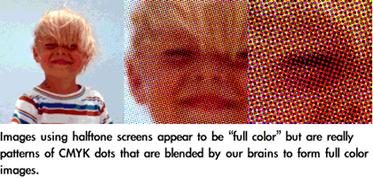
The CMYK color process is the most common color mixing process used today for subtractive color because it is the most versatile, offering the widest range of reproducable colors using only the CMY primaries and black. This versatility makes the process invaluable for inexpensive color reproduction, creating the availability and abundance of printed color images that surround us in the modern world. The CMYK process is often applied not to actual color mixing, but to the creation of halftones and dithered patterns of ink dots that we interpret as full color. Color halftones create color images the same way that black and white lines and shapes can create a range of value.
Color Debates
There is an ongoing battle in art about color principles, with the majority of modern color disagreements divided by those who use traditional color theory versus the scientific approach. Heated debate about color principles and color usage is documented well before the Renaissance, so it’s no surprise that color continues to evoke conflict.
Science has proven that the CMY color system is better than RYB for creating the greatest range of color, but there are some reasons for still using RYB. Traditional color theory is an old standby that can create satisfying results by hand. The same reasons red, yellow, and blue may have been originally chosen, because they create a satisfying visual reaction, still apply to RYB even though we have the scientific color mixing system. The traditional color system provides working methods for the aesthetic and emotional application of color, whereas the modern color system does not include human reaction within the scientific principles.
Because CMY is a better system than RYB for the creation and exact reproduction of the widest range of reflective colors, there are those who claim the RYB system is useless, that it doesn’t work, or that it never worked. The logic behind those conclusions is faulty because (1) RYB color mixing can be done, right now, with decent quality traditional materials and media, and (2) if it could not be done thousands of oil paintings and artworks in museums would not exist because the artists could not have used the techniques to mix color, and (3) those artists would not have taught their apprentices and students the concepts, who then effectively used the principles and passed the process to others for over 500 years. As with most aesthetic principles, traditional color systems are not science. Treating them as such is making the faulty assumption that art and design are science.
The cause for most of the current debate is that science is sharing traditional art terminology that is similar enough in meaning to cause confusion. The scientific principles are exact; traditional color theory is not. People get upset when they get confused. Unaware of the history, sources, and reasoning for these aesthetic principles, the misinformed assumption is that the traditional color theory system is wrong because it doesn’t match the modern, scientifically modified definitions of color terminology.
Scientifically, a primary color is a color that cannot be created by combining any other two colors. That ability and restriction is not part of the traditional definiton for primary colors, but added when science adapted the artistic terms to fit scientific principles.

Complementary color is another area of confusion. The traditional complements are obviously not the same as those used by color science. The definition for complements was originally used to describe aesthetic color interactions, but science adapted the term and it now requires that complements must mix to create gray. Because of the differences people get extremely frustrated when trying to apply the concepts, since all systems use the same terminology.
Unfortunate attempts to blend the traditional system with the science use the traditional color wheel but with cyan renamed blue and magenta renamed red. This leads to the principles of both systems being compromised and even more confusion. It is best to leave the traditional and scientific systems as separate methodologies for color use.
A solution to minimize confusion is to pick the methodology that will create the desired aesthetic results and stick to that system until it is comfortable before experimenting with another. It doesn’t matter whether traditional or scientific color mixing methods are chosen; if the user isn’t familiar with how the system works it won’t be effective.
In many cases there is no choice for which method is used to create color, but that doesn’t restrict creativity to what methodology will be used to make color choices. Video uses RGB for color, so obviously the RGB system must be used for creating the colors used in a video. The RGB system must be used for actually creating the work, but the traditional methodology for color can be applied when making aesthetic decisions.
Another reason to be familiar with traditional color theory is when trying to understand or stylistically reproduce work that was created using traditional technique. For example, most art created before the 20th century relied on traditional color theory. If the goal is mimicking an Impressionist painting that used RYB for primaries and complements, it will be easier to understand and duplicate the artistic style if the same creative process is applied while making the new image.
CMYK is the best method for print reproduction of the widest range of different images, but better results can be obtained when using specific inks matched to a specific image. When reproducing an image there may not be a need for the same wide range of color that is necessary to reproduce a photograph. The reproduced image will look much better if the inks are specifically matched to the original art. An example would be if the art had far more blue than other colors. The best reproduction would use a blue ink, or even multiple blues, that would better represent the subtleties of the original. The use of several optimally chosen inks for printing will make the reproduction far more accurate with richer colors than the generic CMYK process. Lithography is one process that uses “tuning” ink selections to the original image to create more accurate reproductions. The resulting images may be better, but the added complexity of these processes make them less suitable to mass media because of the added expense.
Color Matching
One of the problems with color creation technology is the number of variables that can affect results. RGB is the most accurate and most versatile, but even RGB devices cannot consistently create the same images. Devices from difference manufacturers using different technologies all change the way they display the exact same color. Even two computer monitors from the same company may display color shift.
When producing video on a computer, it is important to view the project on a television monitor before distribution. Even though LCDs and computer CRT monitors are RGB devices, they use different methods than NTSC and PAL televisions for displaying video signals. The best method for video proofing is to view the work on a professional studio monitor. Unlike standard televisions, studio monitors are made to stricter standards with better calibration. CRT displays of every type will change alignment depending on environmental conditions and how long the CRT has been running. Studio monitors are less susceptible to these changes, but also allow for easy user compensation and recalibration. If a professional studio monitor isn’t available, viewing the video on a consumer television will give a more accurate idea of how most people will see the images. This allows for some color adjustments before the product is reproduced and distributed.
CMYK printing devices share similar problems, based on differences in inks, printing media, and software.
The color matching problem grows when images created using RGB devices are reproduced on CMYK devices, such as creating an image on a computer and printing it on paper. There is no possible way for a printed image to display the full color of an RGB image. It is impossible for subtractive color to look the same as additive, no matter how good the printer is. That’s a problem with creating images on an additive color RGB device that are destined for reproduction with subtractive color.
The current solutions to the descrepencies between RGB and CMYK devices are color calibration and color matching. Before images are created, the RGB screen to be used is adjusted to match a color standard. Any variations from that standard are stored in color matching software, along with the information for print reproduction devices. When the finished product is printed, the software will attempt to use the RGB and CMYK information to make the results appear as close to the RGB screen image as possible.
Apple’s ColorSync is one such technology. Pantone is an example of yet another color matching system, intended for reproducing color with inks. Color matching was a problem long before most art and design were created on computers. One solution is to have physical swatches of Pantone colors available when creating images. Picking the Pantone color from the swatch and specifying that ink will guarantee (almost) that when the image is reproduced by the printing house, the printer will use the same ink and it will match the color chosen by the designer. This gives the designer more control over color matching.
The same process is used with graphics software when a designer picks the swatch color, specifies that color in the computer image, and the ink color information is sent to the printer instead of the color that appears on the computer screen. The way the colors appear on the RGB screen is only an approximation, and no longer as important to maintain consistent reproduction.
![]() Copyright © 2003 Andrew Kator,
akator@atpm.com.
Copyright © 2003 Andrew Kator,
akator@atpm.com.
Also in This Series
- Part 8: Pattern · February 2004
- Part 7: Type as Shape · January 2004
- Part 6: Color Science · December 2003
- Part 5: Shape · November 2003
- Part 4: Line · October 2003
- Part 3: The Illusion of Depth · September 2003
- Part 2: Using Color · August 2003
- Part 1: Using Value · July 2003
- Complete Archive
Reader Comments (9)
Is it called "key" because it was the key to get a deep enough black when printing?
...like:
1. Key move, the correct initial move in the solution of a set problem.
...or:
2. Or maybe it's from Photography/Painting: The dominant tonal value and colour intensity of a picture.
3. Or in the sense of the "level of intensity"
4. maybe from "to key to", to harmonize with
Having said all that I defer to your expertise and would appreciate further illumination on the topic.
Thanks for an excellent series.
I an more general sense, using tints instead of saturated color will create a suggestion of early/late, mist, and cloudy conditions. At the brightest point of the day, there is a "yellowish" cast to color due to the sun. With dawn/dusk, there is a "blueish" shift.
The colors I suggested do not apply to painting the sky, since because it is the source of light (and lighting) colors should be "pure" and representing the light. The suggestions are for the objects in the landscape/scene.
I am checking things to find the exact answer to your question. I suspect it will be in materials from the "Romantic" period of painting, but it will take several days for me to find the exact references.
Still trying to find the answer...
Add A Comment