Quick Tips in Design
Part 7: Type as Shape
Type and written language are abstract shapes, lines and shapes arranged to create images that have symbolic meaning. Typography is the study of type, typefaces, and the evolution of the printed alphabet.
The earliest forms of visual written communication and storytelling were sculptures and pictures that our ancestors created to represent and possibly worship the world around them. Representations of the sun, moon, trees and plants, and especially people and animals were common in these early works of art. These images could communicate, but they were not yet a developed written language. Eventually visual communication developed into pictograms (abstract shapes that are visually recognizable as real objects), ideograms (stylized illustrations that can represent an event or idea), and phonograms (sounds represented by images).
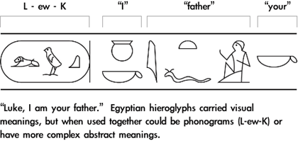
Through the millennia, the written languages of different cultures blended and mutated with trade, war, and the rise and fall of civilizations. One of the most influential trading cultures was the Phoenicians. Because of their travel they adopted and spread ideas from one society to another, both drawing from and influencing other cultures. Over time they adapted and merged language and writing from other cultures into new forms of Phoenician, which then spread throughout the other societies they came into contact with. Phoenician language heavily influenced the Greeks and Romans, who in turn spread their languages throughout other societies with trade and warfare. Most modern Western letter forms can be directly related to Roman chiseled writing from around 100 AD.

Development of Type
For thousands of years written language was created by hand. Artists, scribes, and carvers used hand tools like the pen, brush, and chisel. These methods of creating written language were extremely time consuming and expensive. There is evidence that many different people in different cultures worked on a solution to the problem.
By the late 14th century, mechanical printing was available in Europe by using carved wood blocks. The entire page would be printed from one block of wood from which the raised, inverted letters had been carved by hand. Most of the printed work using this technology was for the Church and could only made in limited number because of the rapid wear of the wood blocks. A more efficient, durable, and adaptable method was needed.
As early as the 11th century, the Chinese had developed a better solution. Movable type is the process of molding the individual letters and characters used in written language and arranging the type to form a page of text (called a matrix), which is then inked and pressed onto paper. The individual letters of the type can then be removed from the press and reused, arranged into a new matrix to create a different page. The Chinese molded the movable type out of clay, a definite improvement over wood for both detail and durability.
Independently of the Chinese methods (according to common history), in the 15th century Johannes Gutenberg perfected movable type using metal and its use in the printing press. Gutenberg used a steel punch with the inverted shape of a letter to transfer the letter onto a softer metal block. The softer metal type was then used to create the matrix. Within fifty years this printing technology had rapidly spread throughout Europe and was used in hundreds of cities.
The terms “uppercase” and “lowercase” commonly used to describe text are from the practice of printers storing their type. The smaller letters were stored in the lower half of the type case and the capital letters in the upper half.
Type Definitions
A typeface is the full collection of a type design. A font is a specific selection within a typeface. A letterform is the development or design of the shape of a character.
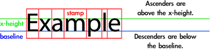
The point system is how type is measured, with 72 points per inch. Point-size is the height of the stamp, the space which contains the individual letters. The baseline is the line on which the letters sit, much like the rules used for handwriting on notebook paper. X-height is the height of the lowercase “x” in the font, generally the height of lowercase letters excluding ascenders and descenders. An ascender is any part of a letter that extends above the body height, usually the strokes that extend above the x-height in lowercase characters. A descender is any part of a letter that extends below the baseline.
The body is the major lines of a character. Serifs are the strokes (fillips) attached to the ends of a character’s body. Bracketed serifs have rounded joints to the major lines of the letters. Serifs help the reader’s eye follow the baseline and facilitate reading. They can also help define the vertical spaces separating letters in a word.

A stem is the main vertical or oblique stoke in a character, for example the vertical line in L or B. An arm is an extended line that only connects to the character body at one end, such as E, K, or L. A cross bar is a horizontal line or crossing stroke, as in an A or t, and is also known as a horizontal, bar, or cross-stroke. A leg is the lower right arm in an R or K, and a tail is an oblique stroke that extends below the baseline as with a Q. A leg may also be a tail if it extends below the baseline. A bowl is the enclosed circular space as with O, g, b, and d.
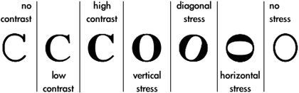
Contrast is the difference in thickness between thick and thin strokes in a font. Stress is the angle at which the strokes in a font change thickness. Vertical stress is when the strokes on the sides of a font are thicker than the top and bottom. Horizontal stress is not as commonly used. Diagonal stress imitates handwriting and script when the pen is held at an angle. If all strokes in a font are the same, with no changes in thickness, there is no contrast or stress.
Weight is the comparative thickness of the individual letters, from light to regular to bold. Style is the shape of the individual letters, such as roman, italic, condensed, or extended.
Shape in Type
Because type is used to convey meaning, the average person doesn’t actually look at the visual elements present in the text they read. At larger sizes the shapes present in characters become even more important. When using type in art and design it is necessary to be aware of the impact of the line, shape, and movement created by the characters both separately and as a whole.
The effects of individual letters can be predicted the same way as the effects of complex shapes. The overall similarity of a letter to one or more basic shapes can predict the letter’s visual impact.
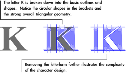
Gestalt applies to type and character design the same way that it does with other forms of line and shape. Visual movement created by a letterform helps focus attention, make the character recognizable, and direct the reader’s eye.

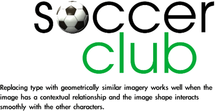
The shapes present in characters are also important when using type with other graphic imagery. Triangular shapes can be matched with triangular characters, rectangular with rectangular, circular with circular, and all of the variations you can think of. Replacing an O with a circular image (such as a soccer ball or another round object) is a simple but effective method of using character shape in a design. This can also work well with other geometrically simple letters.
Typefaces and Classification
Many earlier printers were also typographers, designing the letters, their shapes, and uses. Many of the categories of type that we use today have their basis in the work these men did in the early developing years of printing technology. Claude Garamond was the first typographer that specialized in type instead of combining his work with printing.
Many typefaces were designed for specific needs and for aesthetic tastes of their time, but continue to be used even today. Typeface designs often have a complex history, some designed centuries ago for use in metal type printing and reworked and adapted for different technologies. Several typographers may have contributed to the design of a modern typeface, using some or all of the type design from their predecessors. Many typefaces are named after the typographer who originally designed or heavily influenced the typeface family.

Blackletter typefaces are the oldest, used by Gutenberg to print his first Bibles. The thick lines, ornate capitals, and large serifs reflect some of the style from the period calligraphy. Blackletter is what many people consider “old English” type. These typefaces were probably easier for past cultures to understand because they were commonly used, but are more difficult for modern readers. This class of type was most commonly used in the 15th century, but there have been many revivals since.
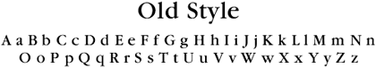
As the Renaissance developed, Western culture began to drift away from the use of blackletter type as more of the visual aesthetics and ideals of Greco-Roman culture were rediscovered and adopted. Type adapted to these changes in tastes and led to what is now considered Old Style. Old Style typefaces are generally recognized by rectangular overall shapes, nonlinear shapes of strokes, low contrast, and bracketed serifs.
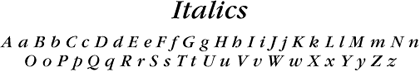
Italics developed to reproduce forms of cursive script, and for centuries were used as separate typefaces from their upright cousins. Typically the entire document was printed in the same italic type, and italic and upright type was not combined in the same way we do today. Many early italics had very little slant.
In contemporary use most italic type is a subset of a Roman (upright) typeface, but there are still typefaces which are entirely italic. Italics are specially designed variations from the Roman versions of a typeface and are most common in serif typefaces.
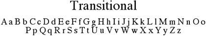
Transitional typefaces began to appear at the end of 17th century and were used throughout most of the 18th century. These typefaces developed from Old Style, and have slightly higher contrast with vertical stress and horizontal serifs. In later transitional type the contrast is higher and the bracketed serifs are more flattened. Transitional typefaces are named from their position, historically and aesthetically, between the development and use of old style and modern type. These typefaces are abundantly used today and appear almost generic to modern audiences.

Modern type began to appear in the late 18th century and was used for most of the 19th century. Modern typefaces have more strong vertical stress and strong contrast with thin serifs and horizontals. These developments were related to the continued interest in Roman culture that began during the Renaissance, and resemble classical Roman text carved in stone. Modern typefaces are “modern” in name only, and because their popularity ended in the early 20th century they are often considered obsolete. Their defined period of common use means Modern typefaces can be used to create an “old-fashioned” or “obsolete” look.

Sans serif (without serif) typefaces generally have lower (if any) contrast and a more geometric appearance. The lack of serifs generally makes these typefaces harder for readers to follow at smaller sizes, but their geometric simplicity makes them popular for use with complex imagery and graphic design. Most sans serif typefaces use obliques instead of italics. A sans serif oblique is simply the same upright type that has been slanted, rather than a specially designed italic.
The legibility problems from the even geometry and stroke in sans serif typefaces have led to the development of Humanist sans serif type. The Humanist typefaces use more contrast, uneven width of stroke, and non-perpendicular cuts (the end of a stroke) to create variations in the geometry. This can make the geometric characters easier for the reader to follow.
Slab serif type has rectangular serifs that are often the same weight as the body strokes. Many slab serif typefaces appear as though they are sans serif with blocky rectangular serifs added. Like sans serif, slab serif typefaces are generally lower contrast and more geometric with more uniform stroke weight.
Decorative And Display Type
Display type is the text that grabs the attention of the observer. Titles, headlines, headers, and subheaders are all examples of display type. Because display type is usually larger than the body text it can be more specialized and may often be decorative.
Fat Face and Wood Type were both used throughout the 19th century for advertising and display. Fat Face developed from Modern typefaces, with high contrast slab verticals and added emphasis on vertical serifs. Wood Type has strong contrast and a lack of fine lines and is often distorted horizontally or vertically. Both of these typefaces are often associated with the American western expansion.
Script typefaces are based on handwriting or calligraphy and can have low or high contrast to hint at the type of pen used. There are many other “handwritten” typefaces, including Comic and Brush. These typefaces are often italic with diagonal stress.

Art Nouveau was developed and used during the late Victorian era, when aesthetics were ornamental with stylized organic and asymmetrical shapes. In what may have been an aesthetic backlash to Art Nouveau, Art Deco is geometrically simpler and lacks serifs.
Type Selection
Using simple and common typefaces allows for other content to come through instead of focusing on or being distracted by the type. Additionally, typefaces that are too different often do not work well together. Many designers recommend staying away from mixing serif and sans serif type unless the contrast between the letterforms has a specific intent or message.
Many 20th century typefaces are not easily classified because they merge different styles. Times New Roman has elements from old style, traditional, and modern typefaces. Blended typefaces have become even more common in the computer age.
Changing weight is easier with sans serif typefaces where a wide range of stroke thickness, from extra light to extra bold, can be obtained because of the geometric simplicity of the typeface. Heavier weight doesn’t work as well with serif fonts because the contrast and stress already present in the type doesn’t convey well with the heavier thickness.
Decorative typefaces are generally unsuited for smaller sizes or for longer sections of text. Highly decorative typefaces are difficult to use for all text on a page because of their they are often illegible when reduced in size. If a decorative ornate typeface is used for a heading or logo, try to choose simpler typefaces elsewhere.
Optical scaling is the process of visually changing type at different sizes to create better readability while still maintaining the design of the type. If very thin strokes are proportionally scaled down as type becomes smaller, they may become so thin the characters are unreadable. The thickest strokes retain the same thickness at all sizes, but the thinner stokes are thicker for small type and thinner for large type. Most professionally designed typefaces use optical scaling, but it may be necessary to apply it manually when letterforms have been distorted or scaled beyond normal use.
Type and typeface design influence the reader the same way as other visual elements. Thinking about shape and type complexities, and how type reacts to other shapes, often helps to create a more unified aesthetic in your layouts, designs, and art.
![]() Copyright © 2004 Andrew Kator,
akator@atpm.com.
Copyright © 2004 Andrew Kator,
akator@atpm.com.
Also in This Series
- Part 8: Pattern · February 2004
- Part 7: Type as Shape · January 2004
- Part 6: Color Science · December 2003
- Part 5: Shape · November 2003
- Part 4: Line · October 2003
- Part 3: The Illusion of Depth · September 2003
- Part 2: Using Color · August 2003
- Part 1: Using Value · July 2003
- Complete Archive
Reader Comments (3)
regard, lydia
Add A Comment