Quick Tips in Design
Part 3: The Illusion of Depth
One of the difficulties with visual art is representing the three-dimensional world in two dimensions. The flat surfaces we use to communicate ideas, including print, television, the Web, and motion pictures, all present information in two dimensions. This article covers some effective techniques for representing the three-dimensional world using more limited two-dimensional media.
Perspective
There are two simple rules about representing depth. Size decreases with distance, meaning objects that are further away from the viewer appear to be smaller. Objects also overlap when one is in front of the other, hiding part or all of the farther object(s). These two observations are the basis for perspective.
The easiest way to understand how perspective works is to imagine standing in the middle of train tracks (not recommended for safety reasons) and looking along the tracks into the distance. Visually follow the tracks to the horizon (where the earth meets the sky) and the tracks appear to meet at a point in the distance. This converging point is called the vanishing point.
Now imagine that as you look at the train tracks converge into the distance, you are holding a piece of rectangular glass directly in front of you. If you traced what you saw onto the glass with a marker, you would be drawing onto the picture plane. Perspective is a method for representing what is seen through the picture plane on another two-dimensional surface.
The train tracks are an example of one-point perspective, the easiest of the perspective methods. This method is useful when representing landscapes, city streets, and other environments in which things are aligned and converge to one central point.

One-point perspective images have a tendency to draw the viewer along the lines to the vanishing point. This effect can be used to greater advantage by placing the subject of an image in front of or near the vanishing point. The viewers will more naturally focus their attention because most of the lines in the image converge onto that area. This effective technique has been used for centuries and can easily be seen in Leonardo da Vinci’s Last Supper and works from other artists.
The boxes to the left to the tracks in the one-point perspective example have one face perfectly aligned parallel to the picture plane. This is a limitation of one point perspective. Another problem with this technique is that objects become more distorted the further they are from the vanishing point, as can be seen with the far left box in the example.
The real world is rarely so organized as to align objects facing the viewer, nor are we often standing in the correct position to observe objects so directly. Because we view most objects from an angle, and not directly from the front or sides, two-point perspective allows us to represent our world more realistically by orienting two faces of an object obliquely to the picture plane.

The book illustration shows an example of two-point perspective. Other than the obvious difference in having two vanishing points, it is also important to note that objects drawn using this method have an edge closest to the picture plane rather than a face as in one-point.
The horizon line in the book image is higher in the two-point example than the horizon in the one-point perspective image. The higher horizon suggests a viewpoint from a higher position, such as looking down upon a book on a table. The position of the horizon line represents the viewer’s eye level and affects how the viewer interprets the image. A lower horizon suggests that the scene is either from greater distance or that the viewer is lower to the “ground.” A higher horizon could also be used to suggest the viewer was looking out a window from a tall building. Horizon line placement is similar to using a “bird’s eye view” or a “bug’s eye view” in photography. These extremes are useful for creating more dramatic visual results. Look for this technique in comic books, where horizon placement and exaggerated perspective are used to suggest action and create more visual interest.
One-point and two-point perspective techniques can be used in the same image if needed to represent different objects. Determine if an object’s face (one-point) or edge (two-point) is closest to the viewer and then use the appropriate method. Each object may also have its own vanishing points, since only aligned objects will share them.

If the corner of an object is closest to the picture plane, then three-point perspective can be used. The third vanishing point is not on the horizon line. The position where the third vanishing point is placed, either above or below the horizon line, indicates whether the viewer is looking up at the object or looking down.
Notice that in the chair illustration the picture plane does not contain the vanishing points. It is not necessary for the vanishing points to be within the picture plane for perspective to work. When creating smaller images using two or three-point perspective, the results will often appear more natural if no more than one vanishing point is in the picture plane at any given time.
Perspective in a Logo
Logos should easily communicate the identity of the business and its product in a unique and recognizable way. In this example the logo is intended for a custom handmade cabinetmaking shop. The logo needs to work for print, but will also need to be easily transferred to paint stamp and branding irons so that the business can use the image to “sign” their pieces. Fine detail will not show up on stamps or irons, so it should be avoided for this project.
The chair used in the three-point illustration is a good starting point for creating this logo. The acronym “MH” was added to represent the shop’s name and distorted to match the perspective used to create the chair. The clean, even lines make results from different reproduction methods more consistent and help the “readability” of the image.
A potential problem with the lines of the white chair is how they transfer to stencils, stamps and irons. Inverting the chair to black with white lines made the image more suited for the other methods of reproduction.

It is always good to present the client with different variations of the same design so that they can choose the one most suited to their taste. In this example all three variations can be used by the client, the white chair for print (using less ink and toner), and the logos with black chairs for stamps and irons.
Logos should easily communicate identity and brand to the observer. There is no doubt the business has MH in the name and something to do with furniture as well. While this example illustrates applying perspective to a logo, it also demonstrates effective logo design.
Using Line Thickness to Suggest Depth
Variations in line thickness can be used to suggest depth. In the example for one-point perspective, the lines of the train tracks get thinner as they “fade into the distance.” Bolder lines can be used when illustrating the same object to bring it to the foreground and demand more attention, with thinner lines receding and creating the opposite effect. Using line variation to suggest depth is another useful technique in illustration, and as with exaggerated horizons and perspective is also frequently seen in comic books.
Shading and Shadow
Shading adds depth to an object by suggesting volume, and shadows place an object in an environment. Both are also used together to indicate light sources in an image and help represent three dimensions in two-dimensional media. Read Part One: Using Value for more information and examples.
Atmospheric Perspective
Objects in the distance become obscured by our atmosphere, including humidity and particulate (dust, pollen, smoke, and pollution). This effect is called atmospheric perspective. Distant objects viewed through clean air will take on a blue or blue-gray color. Humidity and fog shift the color more to gray. Brown, violet, or orange can be used to mimic pollution and smoke.
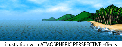
This natural interpretation of distant objects is one explanation for why cool colors (closer to blue) recede and are less prominent than other colors. Colors viewed from a distance will also be less saturated. For further explanation of color usage, read Part Two: Using Color.
Another effect from the atmosphere upon distant objects is a change in contrast. Objects viewed from a distance will have less detail and lower contrast with fewer lights and darks. Shadows, highlights, and reflections are less extreme or not present at all when viewed from a distance. Use more contrast in foreground objects and less in the background to suggest depth and focus attention. More information about contrast can be found in Part One: Using Value.
Anyone who has played with photography understands that when the camera is focused on a close object, the background may appear blurred. Blurring the background in an image simulates this effect while also decreasing contrast and detail.

Some argue that focus is an atmospheric perspective effect, while others feel that it is a separate technique. Those arguing against suggest that our reaction to blurred images as distant is a development of photography and the abundance of photographic images in our modern world. Our eyes rapidly change focus to whatever we are looking at, so our brains rarely interpret what we see as being “out of focus.” Support for this viewpoint is found in artwork created before the invention of photography where the technique of blurring distant objects is predominantly missing. Whether it is a instinctive environmental interpretation as with the other atmospheric perspective techniques or a learned response to photographic imagery, blurring distant objects in an image can be an effective technique for adding depth.
Applications
Most of the techniques covered in this article are used by 3D software to create images in perfect perspective with atmospheric perspective effects. With such tools available, why anyone needs to know the information in this article is a question often asked. Knowing how to simulate depth helps to create better images, even using 3D software to do most of the work. It helps to know what to look for in order to make the software do it.
Many images created with 3D software must be combined with photography or illustration to create the finished product. Star Wars: Attack of the Clones is a good example. Most visuals in the movie, minus the actors, were created using 3D software. The live footage with people was combined with the computer generated images, but the finished images had to work together to be convincing. If the actors were in different perspective from the setting, it wouldn’t matter how great the 3D images were because the two wouldn’t match and people wouldn’t like the movie.
Knowing how things work is a large part of what is required to make things work. In that respect, art and design are no different from science and invention.
Problems can occur when combining multiple images together, not only with mixing photographs but also when using illustration and clip art. Each image may be perfect by itself, but put together with other images things don’t look right. Even if the problem isn’t obvious, you can often find inconsistencies by checking perspective, line variation, shading and shadow (direction of light sources), color, contrast, detail, and focus. The problem may be one thing or a combination, but corrections are easier when you know what to look for.
![]() Copyright © 2003 Andrew Kator,
akator@atpm.com.
Copyright © 2003 Andrew Kator,
akator@atpm.com.
Also in This Series
- Part 8: Pattern · February 2004
- Part 7: Type as Shape · January 2004
- Part 6: Color Science · December 2003
- Part 5: Shape · November 2003
- Part 4: Line · October 2003
- Part 3: The Illusion of Depth · September 2003
- Part 2: Using Color · August 2003
- Part 1: Using Value · July 2003
- Complete Archive
Reader Comments (13)
Thank-you!
Yvette
Thanks,
C
Add A Comment