The Personal Computing Paradigm
Mac OS X: Aqua Included
In the commodity market of personal computers, three factors sell boxes: price, performance, and design. Apple cannot make cheaper machines than the competition, and Macs are arguably faster than PCs, but not enough to make performance a deciding factor for the majority of computer buyers. Therefore, Steve Jobs wants Apple to be known for design, an area where it has traditionally excelled: witness the original Macintosh, the first PowerBooks, and Apple’s current four-square lineup. Bill Gates missed the point when he quipped that the Apple now had leadership in colors. Had the iMac and iBook been unsubstantiated flash, their stations at the tops of best-seller lists would have been ephemeral at best. Apple’s consumer lineup has succeeded because it combines good form with good function.
 So far, the Aqua interface that Steve Jobs demonstrated for Mac OS X has generated the same sort of comments that the iMac did. Nearly everyone is wowed when they first see it. After that, they either can’t wait to get their hands on it, or dismiss it as substanceless eye candy (or Apple-branded iCandy).
I believe that, as usual, the truth is somewhere in between. Aqua is certainly the nicest looking interface I have seen, and it makes Windows look like the ugly stacks of grey rectangles that it is. Aqua is vaguely reminiscent of the original Macintosh interface. Its windows again have a clean, borderless appearance, and the familiar pin striping is back, updated for the post-iMac era. But the similarities end there. Although Aqua is clearly designed in the Macintosh spirit, Apple has made many refinements and down-right changes. Now is the time to examine them and provide feedback, for by the time most of us are able to actually use Mac OS X, much of it will be set in stone.
The New Finder
Jobs said that (aside from inducing tongue movements) the goal of Mac OS X’s new interface was to make Macintoshes easier for beginners and more powerful for experienced users. The Finder seems like a fine example of this philosophy. Contrary to popular opinion, Apple has not replaced the Finder we know and love with the NeXT FileManager. The new Finder borrows heavily from the Mac and NeXT worlds and looks, to me, like the best of both. It supports the traditional icon and list views, as well as a new Columns view taken from the NeXT FileManager. Although by itself Columns is horribly inadequate as a replacement for the Finder, it makes a wonderful addition to the Finder.

In the latest demonstration, the new Finder has a row of buttons in place of the FileManager’s shelf. The first is reminiscent of Microsoft’s My Computer window; it displays all the volumes accessible to you. The other buttons are Home, Apps (which presumably finds all the applications you have installed), Docs, Favorites, People, and View. The View button toggles the window’s display between Icon view, List view, and Columns view.
At the top right of the Finder window is a search box. In Mac OS 9, Sherlock’s feature set is adequate for my needs, although regular expression and Boolean searching would be nice, but I rarely use it because of its speed (or lack thereof). If Apple makes the Finder’s search box fast and incremental it will be my favorite addition to the Finder.
The pop-up menu is the new location for the hidden menu that you used to get by command-clicking in the title bar of a window. Now it’s in the open where newbies can easily discover it—a nice idea, but I hope I can optionally choose the old behavior to save space.
Next to the pop-up menu is the most radical change. The left-pointing triangle is a “Back” button that behaves just like in a Web browser. By default, the new Finder browses in place: double-clicking a folder icon opens it in the current window, rather than spawning a new one. Browsing in place is intended to reduce window clutter and can potentially make the interface less confusing. But it remains to be seen whether this will be offset by the disadvantages of breaking the desktop metaphor that has served Apple well for more than fifteen years.
One of the reasons the current Finder is so efficient for me is that I have many windows open at once and can easily recognize them by their shapes, sizes, locations, and icon arrangements. The new Finder will let me work that way, but I question whether the browse-in-place mode should be the default; for although it looks nice in demonstrations, it appears to deprive users of the sense of control that the Mac Finder has always given them over their work spaces.
Different people have different work styles. If Apple makes it easy to switch between the new and old Finder looks and behaviors, they can make nearly everyone happy. However, I am concerned that the list view Steve Jobs demonstrated did not have disclosure triangles to expand folder contents. This was one of System 7’s best innovations, and Apple would be wise to keep it.
Open and Save Dialog Sheets
 Open and save dialog boxes now slide out from document window title bars, making it clear which document they pertain to. These dialogs have always been the most difficult part of the OS for new users to intuit. The Navigation Services dialogs introduced with Mac OS 8.5 were merely an enhanced version of the originals, but Mac OS X introduces something completely different and, in my opinion, better for everyone. The new dialog contains a text box to name the document and a pop-up menu for choosing where to save it. What could be simpler? Alternatively, you can use a Columns view to quickly tunnel up and down directory hierarchies.
I hope that Apple will incorporate “Click, There It Is” functionality so that it’s easy to choose a folder that’s already being displayed in a Finder window. Other than that, the new dialogs, or “sheets,” seem great.
Dock
The Mac OS X Dock is a combination of the Windows 95 TaskBar and Unix window minimization, on steroids. The dock holds icons for every running application, as well as previews of minimized windows and the icons of any files or folders that have been dragged onto it. The Windows TaskBar becomes unwieldy when it contains a lot of items, because the names get so collapsed that it’s impossible to read them. OS X solves this problem (not!) by showing icons without names. To see the names of icons in the Dock, you must scrub the mouse over them individually. As with the browse-in-place Finder, this seems to trade usability for lack of clutter. The current WindowShade model of minimizing windows creates a lot of clutter, but windows are easily differentiated by position, size, title, and proxy icon. With the Dock, everything is neat and tidy, except that with so many unlabelled icons, how can one find anything?
Another potential problems is that, since the Dock is at the bottom of the screen, there’s no place for pop-up windows. These were one of my favorite additions in Mac OS 8, and OS X appears to offer nothing to replace them. Apple could kill several birds with one stone by moving the dock to the right (or left) side of the screen. This would create space at the bottom for pop-up windows and make more vertical screen space available for document windows. (Vertical screen space is more valuable.) Since the Dock would then fill vertically, it would always use a constant amount of horizontal space, which could be used to display names for every icon.
If done right, the Dock can improve upon Mac OS 9’s tear-off application palette and WindowShade model. However, Apple clearly has some more work to do.

Icons
Icons in OS X look like photographs, rather than the symbolic line drawings to which Mac users are accustomed. On the plus side, this means that if a developer makes one icon at 128 by 128 pixels (the new maximum size), the system can reduce the size of the icon to pretty much any size without it looking too bad. This makes the Dock’s flashy rollover effect possible.
Nevertheless, I think the original symbol-style icons are preferable because they are easier to interpret and recognize (especially at small sizes). The old icons are designed to make good use of screen space, while the new ones seem designed mainly to look pretty. Apple’s Web site states that since screen resolutions have increased so much since 1984, it’s time that icon resolutions did too. But in my opinion, larger icons do little to improve clarity and consume screen real estate that, if anything, has become more valuable. My 21" monitor shows approximately six times as many pixels as the original Macintosh’s screen, but I use it to run twelve times as many applications at once, and to navigate hard disks with hundreds of times as many files. Frugal use of screen space is more important than ever.
Menus
Steve Jobs says that Macintosh menus are the best, so Apple decided not to change them much. Good call. There are two things that bother me, however.
First, there is no longer an application menu on the right side of the menu bar. I’ll miss it because when there are many items in the dock, a sorted application menu will still be very useful. Also, a great improvement in OS 8.5 was the ability to display the active application’s name in the menu bar. It would be a shame to lose this in OS X.
Second, the center of the menu bar now contains an inert Apple icon. This is not the new location for the Apple menu (which, as we know it, appears to be history). Instead, it’s Apple’s way of branding the OS—as if we didn’t know we were using a Mac already. The worst part is that menu names wrap around the Apple when they become too long to fit on the left side of it. Apple is supposed to be known for good design!
Windows
 The new traffic light controls for closing, minimizing, and maximizing windows have drawn a lot of attention. I don’t personally find the colors intuitive, but the symbols (X, -, +) make the meanings clear enough. It may take a while to get used to the new colors and symbols, but I don’t expect them to be a source of lasting frustration.
The more important question is how Apple chose the placement for the new buttons. Twenty-five million Mac users are accustomed to having Close on the left and Zoom and Collapse on the right. About ten times that many are accustomed to having all three on the right. Apple chose to group the buttons, like Windows does, but to put them on the opposite side of the window and in a different order from either established system. If they have convincing evidence from user testing to justify this change, then I will accept it. But absent that, Apple deserves serious criticism for changing something that wasn’t broken.
The Aqua Look
 Aqua replaces the Advanced Macintosh Look & Feel box in last year’s OS X schematic. Most of its functional changes could just as well have been implemented using the familiar platinum appearance, but obviously Apple decided that Aqua was cooler and more marketable. I agree, and although there are questions about whether it will be too distracting or go out of style, I am cautiously optimistic about it.
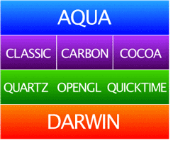
However, there are unanswered questions about how well it will work with the variety of applications that we have today. This is a bit confusing because on the one hand, Apple’s schematic (see above) shows Aqua on top of the Classic box. This is clearly wrong because Apple has stated that Classic applications will look as they have always looked. This makes sense from a technical standpoint, and even conceptually because Classic applications are different. However, Apple’s questionable changes, the moved window widgets and rearranged menubar, will make Classic applications stand out more than necessary. Perhaps Apple has done this on purpose to pressure developers into Carbonizing as soon as possible. But what it really does is penalize everyone who makes use of old software that still works.
Carbon applications, on the other hand, will be first class citizens in OS X. They’ll enjoy the latest look and feel—or will they? Carbon applications will certainly use new-style menus and traffic-light window widgets. However, Carbonizing does not necessarily include rewriting an application’s user interface. Since most applications use a mix of custom, library, and Apple-supplied code to draw buttons, pop-up menus, checkboxes, and other user interface elements, there’s no way that Apple can give Carbon applications a uniform Aqua appearance inside their windows. Developers will have to do a lot of work to make their Carbon applications look at home both in OS X and in OS 9. Making their custom interface elements fit with the Aqua look may be especially difficult, because it is so much more complex than knowing which shade of grey to make buttons and which size font to use. Apple should be making it easier to write good Mac applications, not harder.
Conclusion
Much that is new in Mac OS X is good. The plumbing is first-rate, and the user interface has some nice improvements. But I question some of the changes Apple has made. From day one, Macintosh users have enjoyed the simplicity of disks that appear and disappear from the desktop as they become available and unavailable. Apple pioneered the desktop metaphor, but the new Web browser-style Finder eschews it in the name of reducing clutter. The Dock reduces clutter, but it will quickly be filled with beautiful but nameless icons. Apple seems overzealous in embracing the new and the cool. It should remember that the Macintosh interface, and the loyalty it instilled in its users, is the reason Apple is still around after a decade of poor management. In the past, the company has shown remarkable ability in combining power, ease-of-use, and coolness. I hope they have not forgotten the proven formula.
![]() “The Personal Computing Paradigm” is copyright © 2000 Michael Tsai,
mtsai@atpm.com.
Michael thinks that Steve Jobs’s executive compensation package was way too excessive, even thought Steve is probably the only guy in the world who could have done what he did. Although Michael wrote the last sentence of this column after reading Bruce Tognazzini’s take on Mac OS X, readers are invited to consider it in light of
Tog’s New Coke analogy. Screenshots in this article appear courtesy of Apple Computer, Inc.
“The Personal Computing Paradigm” is copyright © 2000 Michael Tsai,
mtsai@atpm.com.
Michael thinks that Steve Jobs’s executive compensation package was way too excessive, even thought Steve is probably the only guy in the world who could have done what he did. Although Michael wrote the last sentence of this column after reading Bruce Tognazzini’s take on Mac OS X, readers are invited to consider it in light of
Tog’s New Coke analogy. Screenshots in this article appear courtesy of Apple Computer, Inc.
Also in This Series
- How Cool Is Your Mac? · May 2012
- Mac OS X’s Increasing Stability · August 2006
- Coping With Mac OS X’s Font Rendering · January 2006
- E-Mail Archiving with Eudora and Mail.app · January 2003
- Grab Bag · October 2002
- Mac OS X 10.2—First Impressions · September 2002
- Mac OS X 10.1—First Impressions · October 2001
- Mac OS X Tips · June 2001
- Mac OS X—Finally · May 2001
- Complete Archive
Reader Comments (1)
Add A Comment