Photoshop for the Curious
An Overview, Part 3
Palette Mania Redux
Last month, I revealed that I leave nearly all of Photoshop’s palettes open on my office Macintosh and logically arranged on a secondary monitor. I had intended to show a screen shot of this arrangement, but I wrote last month’s column while on Christmas holiday break and didn’t have access to my office computer:
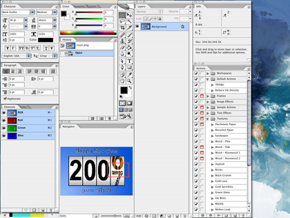
A sample arrangement of nearly all Photoshop’s palettes. (click to enlarge)
Don’t take the above arrangement as a suggestion from me. Rather, it’s simply a palette arrangement that works for my situation. If you have a secondary monitor and wish to have all the palettes open, you should definitely experiment and reposition to find what’s best for you. Notice that I’ve still got some palette tabs grouped into one window, and that some of the vertical columns of palettes are attached together using the steps I described last month. For the record, the only reason my Actions palette is not attached to the Info palette is because the height of the Info palette increases when color samplers are set, and I don’t want my Actions palette to shift downward when that happens.
Moving along, it’s now time to glance in each of the Photoshop menus and learn some of the tasks for which they’re used. Bear in mind, menu items sometimes replicate features found in the palettes. In addition, right-clicking (or Control-clicking) areas within an image generally produces a contextual menu containing the most relevant menu functions. As you become more proficient with Photoshop, you’ll find yourself pushing your mouse up to the menu bar less and less frequently.
Application Menu
The first menu is one with which you should already be accustomed. It’s the Application menu, and it’s where—like in any other application—you access the opening splash image, preferences, commands to hide or quit the application, etc.
Secret About Box
Since the very beginning, Photoshop has featured an easter egg known as the Secret About Box. Hold down the Command key while selecting About Photoshop… to access it. It generally always contains some sort of humor as well as the development code name of that particular version of Photoshop.

Adobe Space Monkey!
Preferences
A whole series of columns over several months could be devoted to Photoshop’s preferences. Not to worry, though. It’s not going to happen here—at least not soon.
Photoshop’s default preferences are fine for most people, but you should definitely look through them all (note that there are nine different panels within the Preferences window) and adjust any that make sense to you. If you don’t understand a preference, even after hovering your mouse for the tooltip, just leave it be.
If you’d like a little guidance, here are some settings I often recommend to people. Your mileage may vary:
If you don’t want your palettes going back to the default after you’ve carefully positioned them where you want them and saved them into a workspace, be sure to check the Save Palette Locations box in the General section.
In the Display & Cursors section, try setting Painting Cursors to Normal Brush Tip with the Crosshair option checked, and set Other Cursors to Precise. The Standard setting just uses a representation of the selected tool’s icon and is very unhelpful to me when editing my images.
If you have a separate hard drive that’s larger and/or faster, you can tell Photoshop to use it for temporary scratch space in the Plug-Ins & Scratch Disks section. This is great for laptop users who would rather let a faster external drive be the one to get Photoshop’s heavy use instead of the slower internal laptop drive.
For the benefit of those who don’t know what scratch space is, Photoshop couldn’t possibly do all it has to do just within the confines of available memory. To combat this, it writes data to temporary space on your hard drive, it does so a lot, and it’s actually pretty good at managing it. But it works all the better when there’s plenty of elbow room and it’s on a fast hard drive.
File Menu
Most of Photoshop’s File menu is just like any other application’s, with items to open, close, save, print, and create new documents. Note that this month’s article isn’t going to elaborate on every single item in every single menu, but we’ll go over a few items that can be fun to play with.
Automate
In the File menu, you’ll find the Automate submenu. Adobe has provided a number of fun tools here. We’ll look at some of them in greater detail in the future, but there are two that I use most frequently. The first is Web Photo Gallery…, which provides an interface for generating a self-contained folder with all the images and HTML files needed for a basic Web gallery. It nearly always takes me a bit of trial and error with the settings to get the gallery exactly how I want it, so I recommend first testing your settings with a folder of only about a dozen images. When you’ve got it right, then just run it again on a full folder of images.
My favorite item in the Automate menu is Photomerge…, which does exactly that—merges two or more photos into a single shot. I plan to devote a future month’s column to Photomerge. For the time being, I’ll say that, with practice, it works better than any merging function I’ve used that comes free with consumer digital cameras.
Edit Menu
Just as with the File menu, the Edit menu is one you find in almost any application and is where the Cut, Copy, Paste, and Undo commands live. Photoshop, however, beefs up these basic commands with functions to step forward and backward through an Undo history, as well as functions that perform copying and pasting as they would pertain to Photoshop’s layers and selection areas.
The Edit menu is where Adobe has placed commands for Stroking (outlining) and Filling a selection with a color or pattern; Transforming an image by skewing, rotating, scaling, etc.; and working with advanced color profile settings.
The bottom of the Edit menu contains two very important features for customizing Photoshop. The Keyboard Shortcuts… item allows you to add, remove, and change keyboard shortcuts assigned to various menu functions. With the Menus… item, you can choose to hide functions found in the menu bar that you never use and just get in your way. You can also colorize them and change the order to help you find them.
Image Menu
The Image menu contains functions that generally affect your entire image—often, but not always, affecting all layers of the image.
Mode
The Mode submenu is where you choose whether you want to work in RGB (Red, Green, Blue) mode, CMYK (Cyan, Magenta, Yellow, Black), Grayscale, and other color modes. Commercial printing presses generally prefer that photos are saved in CMYK format. Otherwise, you’ll generally always want to be in RGB mode since some Photoshop functions are not available in CMYK mode. If you’re working on images to put in a video (e.g. you’re using iMovie), keep in mind that video is also RGB.
The Grayscale mode will convert your image to black and white (grayscale is a more accurate term since there is also a Bitmap mode, which truly is black and white—with no shades of gray). But before just selecting Grayscale mode, there are ways you can make your grayscale photos look much better—and that’s this month’s tutorial which I’ll cover after this menu overview.
Adjustments
This powerful section of the menu bar is where you get to be the photo lab technician and tweak the color hues of your image. It’s here that you’ll find Photoshop’s very basic Brightness/Contrast command, which works in a pinch, but in an upcoming column we’ll look at the Levels and Curves tools that offer far better control than Brightness/Contrast.
Modifying the Entire Canvas Window
The Adjustments submenu is also where you can scale the size of your image, increase or decrease the size of the canvas window around your image, and rotate your image. Yet another topic for a future column is using the Image Size command—specifically regarding the Resolution setting and the difference between whether or not the Resample Image item is checked.
Layer Menu
The Layer menu contains, as you would probably guess, functions that affect individual layers of your image. As such, some of its functions are unavailable if your image is flattened into a single background layer. Other than creating, removing, and duplicating layers, most of the Layer menu functions can be a bit on the advanced side, and we'll cover them as needed.
Select Menu
When you use the Marquee Selection Tool or the Magic Wand or in some way create a selection, the Select menu is where you’ll find things that you can do to tweak your selection, as well as tools for making a new selection in ways you might not ever have thought of. Remember—this menu only deals with selections and not your actual image. In theory (and I say this because I welcome correction if I’m wrong), anything you do in the Select menu does not immediately change your image.
The first portion of the Select menu simply offers commands to select the entire image, deselect any current selection, reselect whatever was last selected, and completely inverse your selection.
The next portion helps control your selection when dealing with multiple layers.
Color Range… is a nifty selection tool that will create a selection based on colors in your image. Its tools allow you to isolate a single color, or to drag an eyedropper across a portion of your image to make a range of colors the selection.
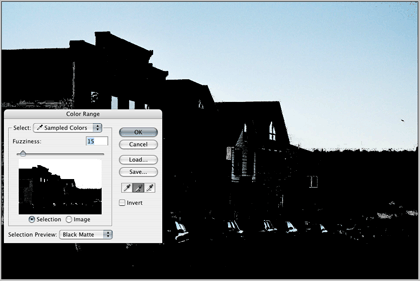
For this image, I have activated the additive eyedropper (the one with the + symbol) and dragged it across the blue sky. As you can see, in addition to selecting the entire sky, the same blue shades were also found in the lower portion of the image. However, these erroneous and unwanted selections can easily be removed, leaving just the sky selected.
Next are several options for changing your current selection. Feather… softens/blurs the edges of your selection by a number of pixels you specify.
In the Modify submenu, Border changes your selection to only include an outline of the selection as many pixels wide as you specify. Smooth will reduce sharp angles in your selection within a threshold of a specified number of pixels. Expand and Contract enlarge and reduce, respectively, your entire selection by a specified number of pixels.
The Grow command can be a little tricky to understand, but it’s fairly simple once you get the hang of it. Suppose you’ve made a selection with the Magic Wand with a five-pixel tolerance. Using Grow will expand your selection an additional five pixels.
The Similar command is also fairly simple in its function. It expands your current selection to include other areas of the image with similarly colored pixels to what is already selected. Note that it selects noncontiguous pixels, which means you may have a selection over on the right side of your image and the Similar selection command could add an area over on the left side of the image to the total selection.
The Transform Selection command is essentially identical to the Transform command found in the Edit menu, except that it only affects your current selection.
Finally, the Load and Save Selection commands store and recall selections for later use. When you save a selection, a new channel is created to hold that selection and can be seen in the Channels palette.
Filter Menu
Photoshop’s collection of filters is another area to which I’ll devote a future column. Feel free to play with some of them. The function of many are pretty obvious from their names, such as Sharpen and Blur.
View Menu
The upper portion of the View menu involves advanced color management, so we’ll skip that for now. The next section contains the Zoom In and Out commands along with a few default zoom levels.
The Screen Mode submenu is identical to the Viewing Mode selector I described in the Tool Palette overview in December. I suppose I erred in calling it Viewing Mode when it is actually called Screen Mode.
The remainder of the View menu adjusts settings for alignment guides and grids, and for slices. Don’t worry about guides and grids for now—and remember that we’ve already established that slices are one of Photoshop’s advanced features and are used when preparing Web pages.
Window Menu
In a sense, we’ve already covered much of this menu last month because it mostly contains items for enabling or disabling Photoshop’s palettes. This is also where you can save and recall custom workspaces, rearrange all currently open image windows, and quickly activate a specific image window.
Help Menu
Oh boy, do I really have to go here? Well, OK. Obviously, this is where you access Adobe’s help engine for Photoshop. Take my advice. Use it! Even if you don’t have an immediate problem with something, try picking a particular feature of Photoshop and reading the help documents about it. You’ll be surprised what you learn.
Also in the Help menu are functions to handle your registration license and manage software updates.
Put ’em All Together
That wasn’t so bad, was it? I do have to say, as someone who has used Photoshop since version 2.5, the placement and groupings of menu items has consistently improved with each major version of Photoshop. If you still don’t like it, Adobe even now allows you to change the menus around however you see fit. There are even a couple of alternative menu bar sets already defined that you may wish to check out.
Better Grayscale Tutorial
OK, time to actually learn something practical. Years ago, a quarterly newsletter I design mostly contained only grayscale (black and white) photos. To convert a color photo, I would, as you’d expect, head to the Image ‣ Mode ‣ Grayscale command. Then, I’d spend time playing with the tonal curves to increase contrast and make it look like a decent photo.
Today, the same newsletter I design is entirely in color and I don’t often print grayscale photos any more. But, when I do, I’ve discovered some new steps to make them look a lot better than simply switching the color mode to grayscale.
We’ll start with a standard digital photo. In this color version, the saturation has been increased slightly from the original.

Yellowstone looks great in color, but let’s get all Ansel Adams on these bison, shall we?

This grayscale conversion isn’t all that bad, but likewise isn’t all that great.
In the past, I would’ve simply changed to grayscale mode, which produces a reasonable photo, but the contrast is generally not spectacular.
Sure, you could get out the Brightness/Contrast tool and increase the contrast. Let’s see what happens.

With the contrast bumped, our image starts to look better, but we’ve completely blown all the detail out of the band of cloud near the top of the image, and the shadowy portion of the grass in the foreground has gone black, having also lost all its detail.
We can achieve better grayscale results by simply adding one small step before switching to grayscale mode. Back at the original, newly opened color image, head to the Image ‣ Adjustments ‣ Channel Mixer command. Check the box at the bottom labeled Monochrome.
Boom (with apologies to Steve Jobs). Look at that sky. Look at the shadow detail in the grass at the bottom. Okay, okay, none of us are likely to become the next Ansel Adams, but this image now looks pretty darn good, if I do say so myself.

In the case of using the Channel Mixer to convert a color photo to grayscale, you can have your cake and eat it, too. In other words, you can quickly and easily apply impressive contrast while not completely blowing out detail in the brightest highlights and the darkest shadows.
After checking the Monochrome box, most photos will do great simply by leaving the Red slider at 100% and the Green and Blue sliders at zero. Tweaking them by subtle amounts might achieve even better results. As always, your mileage may—and very likely will—vary significantly.
Once you’re satisfied, now it’s time to hit the Grayscale mode in the Image menu. Voila!
Next Month…
Here’s your homework assignment. First, open copies (remember, always keep original versions of your images) of some of your favorite photos and experiment with the various options in the Image ‣ Adjustments submenu. Some will produce a control window with adjustments. Others will simply do the command with no interactivity. Make a prediction of what you think will happen before invoking each command, then take note of what actually happened.
Big reminder: besides any original, unaltered JPEGs from a digital camera, you should also save Photoshop .PSD files so as not to add additional compression to your work. Save flattened JPG copies from the Photoshop document as needed. Alternatively, you can save as TIFF, which also does not add compression artifacts and is more compatible with other graphic applications that won’t open Photoshop files. The drawbacks are that layer support in TIFFs can be unpredictable, and that single-layer TIFFs are larger in file size than single-layer .PSD files.
Now that I’ve completed the introductory overview, it’s getting to be about the right time to make sure your monitor is set to display colors reasonably accurately. While it’s true that using a stick-on sensor that measures color output is the best way, such a device is really only needed when doing professional color output. For your purposes. Mac OS X’s built-in tools for color calibration will suffice, and we’ll learn how to do that next month. Once you’re seeing your photos’ colors more accurately, we’ll be in good shape to also take a look at Photoshop’s Levels control and learn why it should be your choice over the Brightness/Contrast control.
![]() Copyright © 2007 Lee Bennett, lbennett@atpm.com.
Copyright © 2007 Lee Bennett, lbennett@atpm.com.
Also in This Series
- File Format Fever · November 2008
- Don’t Reset—Preset! · October 2008
- Don’t Yield—Merge! · September 2008
- What If I Just Left It Alone? · August 2008
- Screen Replacements—When Reality Isn’t Real Enough · July 2008
- No Smoking Gun: Re-tooling Dodge and Burn · May 2008
- Mask-erades · February 2008
- Back in February · November 2007
- I Love Layers · October 2007
- Complete Archive
Reader Comments (2)
Add A Comment