Web Accessibility
Part 3: Color and Type
Most of your time exploring the Web is spent reading—and attention to your text content is a great place to start making your Web site more accessible. In our last installment, we looked at text and language as they pertain to accessibility. This time, we’ll look at issues surrounding color and type—the way you visually present your text.
Who Benefits?
Broadly speaking, your choices of type and color will have a big impact on two groups:
- Those with impaired or low vision find that appropriate text sizes and color combinations make for an easier time with reading. They may also be using some simple techniques to more easily view your page, such as adjusting their browser’s preferences to increase text size, or overriding your color choices altogether. Some with a more dramatic vision impairment might be using a screen magnifier or something similar to assist them.
- Those with a colorblindness condition usually have some trouble differentiating between various colors. Hues that seem reasonably different to someone with normal color vision can seem almost identical to someone who is colorblind—contrast helps here, too.
We’ll look at ways to make sure that your text stays flexible, and that your choice of colors doesn’t cause confusion.
About Colorblindness
The term “colorblindness” might lead you to believe that a colorblind person would see the world like a black and white movie. While there are a few people who are unable to see any color at all, or who have fairly low color perception, the vast majority of colorblind people actually have trouble distinguishing certain pairs of colors.
Let’s take a moment to find out a little more about how this works.
Understanding Colorblindness
Colorblindness affects around 8-10% of Caucasian males and less than 0.5% of females. It is more rare for other ethnic groups to experience colorblindness.
- Protanopia is a condition where reds and greens can be difficult to distinguish; furthermore, reds often appear darker than they really are.
- Protanomaly is a similar, but generally less severe condition. The colors are still difficult to distinguish, but some perception is still available.
- Deuteranopia is similar to protanopia, but reds maintain the same brightness value. It’s caused by a deficiency in the cells that detect green light.
- Like protanomaly, deuteranomaly is a similar but less severe condition. Deuteranomalous vision is also the most common form of hereditary colorblindness.
- Tritanopia involves confusion between blues and greens. It is extremely rare to inherit tritanopia, but it can be acquired due to conditions like diabetes or Parkinson’s disease, or simply through old age.
- Atypical achromatopsia is a decreased sensitivity to color. Only very clear colors are easily distinguishable. It is normally inherited.
- Typical achromatopsia is a complete inability to see color. It is normally accompanied by photosensitivity—that is, “normal” light levels are too bright. Both forms of achromatopsia are incredibly rare.
For both protanopia and deuteranopia, it’s well accepted among researchers that variations on yellow, orange, and brown colors are probably what people see in place of red and green. So as well as confusing red and green with each other, it’s likely that those hues in between can be confusable too.
The following simulated photographs use this theory to demonstrate how color deficiencies in their more severe forms can affect the perception of color. You can use the tools at Vischeck or the Colorblind Web Page Filter to perform similar experiments on images and Web pages.

Top: Unaltered image. Bottom, left-to-right: Protanopia, deuteranopia, and tritanopia simulations.
Now Don’t Panic!
Don’t be put off by all these different variants and their sometimes-dramatic results. Any problems that a colorblind user may encounter with your Web site are often due to matters of contrast and distinguishability, which we’ll also address when we’re thinking about people with poor vision. So hold that thought; we’ll get to it in a little while.
Low Vision, Visual Impairment, and Visual Difficulty
It’s easy to forget that visual impairment doesn’t just mean white canes and guide dogs. You can diligently put alt attributes on all your images, make sure that there’s a text equivalent for everything, and test your sites in Lynx to see if they make sense. But a huge number of people who have a visual impairment or difficulty are still using their display, which is why color and type still matter to a large number of people.
What’s more, there are people whose vision just isn’t what it used to be: as one gets older, vision can often degrade. That’s just a part of the aging process. Heck, I’m not even thirty and my vision’s getting worse.
People with low vision or a visual impairment will most often be using a normal display along with an adaptive technology, like a screen magnifier, or simply using the settings in their operating system and applications to adjust text size and color. Some like to use a text-to-speech facility or a full-blown screen reader in addition to their display.
If you’re using Mac OS X, you can use the Universal Access preference pane to get a general idea of how a screen magnifier works. It magnifies the portion of the screen under your mouse—not just text—and moving your mouse causes more of the screen to roll into view.
Web browsers in particular have two functions that can help people adjust text and color. If you take a look in your browser’s preferences, you should find that you can override the Web designer’s choice of colors for backgrounds, text, and links, and you can choose your favorite fonts and sizes for different types of text.
In many browsers, you can even create a user stylesheet to get extremely granular control over the way things work. You want every page you see to use blue text on a white background? All links to be bright red? No problem. If you’re unfamiliar with stylesheets, that’s fine—you can even have one generated for you.
If I had a dollar for every complaint I’ve heard about Web designers and their choice of text size, I’d be able to buy you all a tasty beverage. If you’re bothered by tiny text sizes, now’s the time to experiment with things like browser settings and user stylesheets. Meanwhile, we’ll look at ways to create Web pages that take these variations into account.
Thinking Practically About Color
Text size, colors, contrast, and colorblindness. That’s a lot to think about. Fortunately, accommodating all these things isn’t particularly hard to do.
Color and Meaning
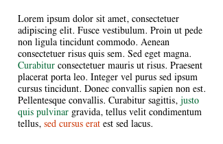
The absolute minimum you ought to do about color is this: do not rely on color alone to convey anything important or meaningful. Since forms are a particularly troublesome spot for accessibility, we’ll use a form as an example.

Highlighting is often used to draw attention to errors in Web forms.
Think about what happens when you fill in a form on the Web. If you’ve missed some essential details, you will usually be told that you can’t proceed until you fill them in. A considerate Web designer will present you with the form again, and highlight the required fields so that you don’t have to go hunting for the ones you’ve missed. In the example above, red text has been used to highlight the offending field.
However, using color by itself causes problems. Someone with a color deficiency might see that red as a dark grey, black, or washed-out brown. Someone using a PDA might not see your color at all. Someone on a screen reader or a text-only browser definitely can’t see your color.

Try using other elements to indicate items of importance.
The example above uses a combination of an image, additional highlighting with a border, and an added line of text to indicate the problem. It’s added a level of redundancy for those who can’t see your colors.
Naturally, using color as a highlight is extremely useful to other groups that need accommodation. People with dyslexia or a cognitive disability, poor language skills, and even children can get a lot of benefit from visual cues like color. However, it should not be the only thing that conveys information.
Colorblindness and Your Images
First rule: don’t worry about decorative elements, photos, or anything else that doesn’t carry out a particular function. Colorblind people are used to perceiving the world in the way that they do, and the fact that they might not see the exact shades in your vacation photos is not going to be a show-stopper.
For functional objects, try to be aware that using confusable hues can cause problems. It’s still OK for you to put red, yellow, and green together, but it’s also important to check that the contrast is sufficient.
Not only is this button really tacky (left), but it could potentially become unreadable when viewed by a colorblind visitor (right).
Similarly, here’s how the new line of iPod minis look when passed through a deuteranopia simulation:

If you had to click on one in order to purchase it, how would you know the difference between the two silver-colored ones, and the two gold ones? Good thing Apple put the color names above the iPods on the Apple Store page. Imagine Mrs. Jones’ dismay if the green iPod her husband promised her turns out to be the Barbie pink variant.
On Links
This particular color crime deserves a special mention.
Now that we have more control over link decoration, thanks to cascading stylesheets, we can play all kinds of neat tricks—remove the underline, give links a background color, change their weight, and so on. Again, it’s not a fantastic idea to merely make your links a different color—in particular, within body copy.
What’s a link, and what’s a highlight? I shouldn’t have to mouse over the link to find out.
You can get away with this if your links are in a navigation bar, a sidebar, or something similar. Web surfers are usually smart enough by now to know that a group of words in a row at the top of the page, or a column down the side, is probably a navigation bar. However, it’s definitely a good idea to use color and something else, like an underline or a background, in your body text.
While this doesn’t affect people using text-only devices or screen readers, it does affect anyone with a color display. Don’t be tempted to bend the rules too much on that one.
Color and Text
When you’re choosing text colors, anyone who’s spent even five minutes learning about design can tell you that high contrast between the text and its background is the best choice for most people. It’s easier to distinguish the shapes of words and letters, especially when one’s vision isn’t so good.
This doesn’t mean that you have to restrict yourself to black text on a white background, or vice-versa. You can afford to venture a little further afield as long as your text is still crisp and legible.
Oh, and this really shouldn’t have to be pointed out, but do avoid busy background images as often as you can manage. Not only are they usually chosen with incredibly poor taste (take a stroll around GeoCities sometime), but the variations in color and brightness can make it even more difficult for someone who’s already having trouble with their vision. If you absolutely must use an image for a background, consider darkening or lightening the image, and reducing the contrast. Less variation in brightness means that the text can stand out over all parts of the image, not just selected parts.

Notice how a reduction in brightness and contrast on the background makes this text easier to read.
Note this well: Remember how we discussed browser preferences—specifically, the ability to choose your own colors? When you define colors for your page, there are five colors that you absolutely must define without fail: background, normal text, link text, visited links, and active links. In old-style HTML, you can specify this in the body tag:
<body bgcolor="#ffffff" text="#333333"
      link="#993300" alink="#000099" vlink="#660000">
And in a cascading stylesheet, which is the preferred technique today:
body {color: #333333; background-color: #ffffff;}
a:link {color: #993300; text-decoration: underline; }
a:visited {color: #660000; }
a:active {color: #000099; }
If you leave one or more out, a person’s browser preferences could come into play for the missing pieces, and that can cause all kinds of trouble. Specify them all, or don’t specify any.
Text: Sizes, Spacing, and More
In general, making accessible text does not necessitate using large fonts or restricting yourself to boring old Times New Roman. Rather, it is the way you specify your font sizes, typefaces, and spacing that makes a difference. Anyone whose browser settings deviate from the default will appreciate your attention to flexibility.
Text Size
Again, thanks to cascading stylesheets, we have more control over how to specify text sizes beyond <font size="4"> and <big>. If you’re still using these old-style tags for defining your font sizes, please be aware that they have long since been abandoned in favor of stylesheets and are no longer recommended.
There’s a selection of units we can use to define our font sizes: some, such as picas and centimeters, have no place on the screen and are best used for print stylesheets. Others relate specifically to screen-based measurements, such as pixels, and still others are displayed relative to the current browser default. The ones we’re interested in are the relative units: ems, percentages, and the font-size keywords.
-
ems are named for the idea that they are the width of the character ‘m’, but are normally somewhat larger. On its own, one em is the size that is specified by the browser setting; when it occurs later in the page, it is based on the font size that inherits from a surrounding element. For example:
body { font-size: 0.8em; }
.footer { font-size: 0.8em; }
In this scenario, the body is 0.8 times the size of the browser default—with the usual default of 16 points, this will be roughly 12 or 13 points. But because of the way elements inherit font sizes from their surroundings, the class
.footeris 0.8 times the size of the body text—about 10 points. Be mindful of inheritance.The redheaded stepchild to the em is the ex, which is named for the x-height of the font, and is around half of the default
font-size. Exes are seldom used. -
Percentages are fairly simple: a
font-sizeof 100% on its own relates, again, to the browser’s default size. If we’re looking at the usual browser default of 16pt text, then 100% is—surprise—16pt. 110% is 16pt + 1.6pt = 17.6pt. Browsers will round that up or down differently, so don’t rely on it for finer control. Percentages rely on inheritance, like ems. -
The
font-sizekeywords arexx-small,x-small,small,medium,large,x-large, andxx-large. Themediumkeyword corresponds to the browser’s default size. The differences between them were supposed to be 1.5 times—solargeshould be 1.5 times the size ofmedium—but most browsers use different variations. Unlike percentages and ems,font-sizekeywords aren’t affected by inheritance. Bonus:xx-smallcan never be too small, as browsers won’t let keyword-specified text get below nine pixels in height.body { font-size: small; } .footer { font-size: small; }Both body and footer would be the same size.
-
We’ve got two more tools in our arsenal: the
biggerandsmallerkeywords. Unsurprisingly, they are a simple increase or decrease of text size, and are inherited.body { font-size: 1em; } .footer { font-size: smaller; }
Point sizes are much favoured by people from the print world, because they’re familiar. However, they can vary greatly between platforms—Macs generally calculate point sizes with a reference point of 72 points per inch (ppi), while Windows machines can use anywhere between 96 and 120 ppi. If you were to define text as 8 points on a Windows machine, it’d be a reasonable size. On a Mac, however, it’s illegible. Here’s a graphic example from the good old days of Internet Explorer 4.
Broken Browser Alerts Aplenty!
- Netscape 4 treats ems as pixels. This is obviously not good. If you use ems, try to hide that portion of your stylesheet from Netscape 4. (Find out how.)
- I’d love to add pixels (px) to the list of acceptable font sizes, and for most browsers they present very little difficulty. Unfortunately there’s a particular browser that does not increase pixel-based sizes appropriately, even when you use the browser’s View menu to increase the text size. That browser—you guessed it—is Microsoft’s Internet Explorer.
- What’s more, Internet Explorer for Windows will sometimes get a little strange when it’s told to use less than 1.0em. 0.9em, rather than being a smidge smaller than 1em, will get several steps smaller. If you’re in the habit of using ems to define your text, you might like to switch to percentages when thinking about smaller text.
- And finally, Internet Explorer 5 for Windows thinks that the
font-sizekeywordsmallrelates to the browser default, notmediumlike everyone else. Oops.
All these choices, and all those bugs. What to do?
Most people’s browser default is 16-point text, and since I care about those in my readership with normal vision as well, I find that setting to be unneccessarily large for most people. I also want the differences between browsers and platforms to be minimal at best.
You can get good results by defining the body element in your stylesheet as either the small keyword or a percentage less than 100% (76% works well), and then using percentages from that to adjust the sizes for other things. People whose browser settings are adjusted to provide larger text will see something larger than the default, and temporarily adjusting the size by using the View menu works for just about everyone. It’s a happy compromise.
Pictures of Text
Put simply, it’d be preferable if you didn’t use pictures of text too often. They cannot be enlarged, or overridden with the viewer’s preferred color, in the way that text can. This is even a problem for Opera, which helpfully blows up everything on the page when you adjust sizes; your image might have become bigger, but now it’s all pixellated. Yuck.
If you must use an image, don’t forget to give it an appropriate alt attribute. Stick to using them for headings: using images as body text is, frankly, an evolutionary throwback. We have better tools to control real text now, and it’s about time you caught up.
When you use a picture of text as a heading, don’t forget to mark it up as a real heading, using the appropriate h1-h6 heading tag. Just put the image inside the headings tags, and voila: now your text browsing and screen-reader-using folks can tell that it’s a real heading, too.
Leading, Width and Spacing
We discussed spacing in the last installment of this series, but a quick recap won’t hurt: it often aids in legibility to leave some room around your blocks of text, and in between lines. Clearly defined areas aid those with a visual impairment or a cognitive disability to identify the areas of your page, while added line height makes it easier to keep your focus on a line.
Give your text areas plenty of margins, and increase the line height of your text. This is easily accomplished with CSS:
p { line-height: 180%; }
div.bodytext { padding: 20px; }
Choosing a Typeface
Oh right, like I’m going to download a whole new font just to see your Web site.
Fonts are best chosen with care, and attention to the fact that there are really very few choices that appear on most people’s computers. From an accessibility viewpoint, it’s not really an issue—fonts that are hard for everyone else to read are generally bad for the visually impaired as well.
For on-screen use, some typefaces are more legible than others. Fonts like Verdana, Geneva, Lucida Grande, and Trebuchet have been designed with on-screen viewing in mind, and have nice, large x-heights on their letters. Fonts like Times and Gill Sans seem somewhat smaller, and the serifs on them can cause “fuzziness” around the letter forms at smaller sizes.
It’s best to limit your font selection to a few choices—changing fonts several times in a document looks dreadful, and can be extremely confusing. A good rule of thumb is to use a serif text for headings, and sans for body—or vice versa.
When you define fonts, do make sure that you provide a few fall-backs. For example, Verdana is quite popular, but it doesn’t cover everyone. As a last resort, specify a generic font family: if none of your named fonts are present, it will choose the browser’s default setting for that generic type.
body { font-family: Verdana, Arial, Lucida, Geneva, sans-serif; }What Do I Do Now?
Testing your Web pages for flexible font sizes is easy: simply bump your text size up a few notches in your browser’s preferences, and see if your page responds well. Try playing with the default settings for fonts and text, and see how that affects your page.
Testing your pages for color-friendliness is not so easy. There are simulation tools, which you’ll find listed below, that can help you see an image as it is likely to appear to a colorblind visitor.
If you’ve looked at your site and found it lacking, don’t panic. As we’ve said earlier, you don’t have to drop everything and spend a bunch of time and money on making changes to your site right now. (Not that it’d be bad if you did!) Gradual changes are okay—consider incorporating these techniques into your next redesign, and try to use them in any new content you’re creating.
Those of you using CSS to control part or all of your Web site’s presentation will have a much easier time—it’s possible to change great swathes of your site in minutes or hours, instead of days and days of work.
It is not unreasonable to expect that your visually-impaired users are willing to meet you half way, and unfortunately many people are completely unaware of the fact that they can do something about font sizes themselves. You may like to consider adding information about how to adjust a browser’s type and color settings to your Web site’s FAQ or help pages. A great example can be found at The Lighthouse, a site about visual impairment and rehabilitation.
If you’re following along with the Web Content Accessibility Guidelines, ensuring that color is not the only thing used to convey meaning is a Priority 1 checkpoint.
Further Reading and Tools
Chapter 9 of Joe Clark’s book Building Accessible Web Sites is free for you to read online, and discusses type and color. The attention to colorblindness is particularly useful, with groups of safe colors that can be used.
The UK’s Royal National Institute for the Blind (RNIB) can give you information on the various causes of visual impairment. Check out their section on accessible design for loads of handy tips.
More on the RNIB: many people are put off by sites about accessibility, due to the fact that they’re mostly as plain as flour. This site is particularly good to look at in that it is both accessible to the visually impaired, while still quite attractive for everyone else. Read all about their design decisions.
You can find out more about the various kinds of colorblindness and the biology behind them at the Wikipedia.
Vischeck allows you to see images or a Web page using colorblindness simulation filters. It’s useful for checking images to make sure they’re okay, and offers some general information on colorblindness.
The AWARE Colorlab helps you choose color schemes from the Web-safe palette and view them with a simulation of various colorblindness. There’s also another Web site simulator, like the Vischeck one, with more options than the Vischeck one.
Fun with user stylesheets: if you have no idea what they are or how they work, there are explanations galore at kynn.com. There’s even a user stylesheet generator you can use—complete with a banner ad-blocking rule!
The font sizing technique I use is based on a discussion of text sizes by Owen Briggs. It features literally hundreds of screenshots of text between browsers, so that you can find the one that suits you best.
 Copyright © 2004 Raena Armitage,
rarmitage@atpm.com.
Copyright © 2004 Raena Armitage,
rarmitage@atpm.com.
Also in This Series
- What Browsers Can Do, Part 2 · May 2007
- What Browsers Can Do · April 2007
- The Flip Side of the Coin · March 2007
- SeaMonkey 1.0.6 · December 2006
- PageSpinner 4.6.3: Quirky and Erratic · November 2006
- Nvu: Impressive and Powerful · October 2006
- RapidWeaver: A Useful Tool in Need of Sharpening · September 2006
- Sandvox: Sand in the Eyes · August 2006
- The Clayton’s Web · July 2006
- Complete Archive
Reader Comments (0)
Add A Comment