The Personal Computing Paradigm
Look and Feel
Apple’s recent recovery has reversed the decisions of some companies to stop making Macintosh software, and most seem to be finding that sales of Mac software are up. Thus, it is discouraging to read tidbits like this one from the maker of a popular statistics package:
We’ve heard many questions about SPSS Inc.’s plans for SPSS for the Macintosh. There has been a lot of speculation about whether SPSS is committed to this platform and about the status of the current version of SPSS for the Macintosh. Although we have been relatively quiet about our plans, it is not because we haven’t been actively working on them. We have a long standing relationship with our Macintosh customers, and want to provide you with the best possible solution for your chosen platform.
As promised, we have explored a solution for using SPSS for Windows on Macintosh G3-equipped computers via emulation. This solution is now possible, and both SPSS and customers have tested this configuration to confirm that the performance is acceptable.
With a “best possible solution” like that, I certainly don’t want to see the worst! There is probably not much we can do about such lack of support for the Macintosh. Besides, there are other problems to worry about. An increasing number of Mac programs don’t feel like Mac programs.
Whenever I make this comment to people, I get one of two responses: “Yeah.” or “Huh?” This article will attempt to explain to the second group why some of today’s most popular applications don’t feel like Macintosh. How do we know whether software feels like Macintosh? Well, if you’ve used a lot of Mac software—particularly if you started using it in the 80s—you can generally tell if something looks or feels “right.” For those who crave specifics, Apple has documented exactly how most Mac user interface elements should work in the book Macintosh Human Interface Guidelines. A companion book explains the additions that came with Mac OS 8. More useful (and entertaining) for the casual reader, though, is Tog on Interface, which is a collection of questions, answers, and commentary based on a column Tog wrote for Mac developers, before he left Apple to work for Sun.
Windows Ports
Lots of Macintosh software is ported from Windows. Sometimes this results in quality Mac applications, but often times it does not. Probably the most well-known example is Microsoft Word 6, which looked just liked the Windows version—and felt like it were running under emulation. The first incarnation of the PalmPilot desktop software was a similar story. (In some tests, I actually found that it ran faster under SoftWindows than natively on the Macintosh.) Fortunately, both of these have gotten better. Microsoft Office 98 is a huge improvement over the previous version, although it still smells strongly like a Windows port. (See my columns in ATPM 4.06 and 4.07 for more on Word and Excel 98.) And 3Com finally fixed up the Mac Pilot software by acquiring Claris Organizer from Apple. What’s worse is that many very Mac-oriented companies are producing un-Mac-like software. Macromedia’s Dreamweaver is a great product, which has some important advantages over the Mac-only GoLive CyberStudio (now Adobe GoLive). Nevertheless, the few times I have tried the demo I could never get past its Windowsisms. CyberStudio is a far more appealing solution for those who don’t rely on Dreamweaver-specific features.
Adobe Acrobat Reader 4
Another example is Adobe Acrobat Reader 4. Adobe has a very strong tradition with the Macintosh, and I don’t think Acrobat 4 is a port. However, the latest version represents a huge decrease in the quality of its interface. It doesn’t feel like Windows, but it doesn’t feel like Macintosh, either. Instead, it has the “Adobe Look and Feel.” It’s nice to know that Adobe’s products are consistent with one another, but why can’t they also be consistent with applications on their target platforms?
First, take a look at Acrobat Reader 3, which is not a shining example of Mac software, but is much better than version 4:
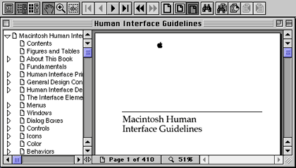
Acrobat 3
Although Acrobat Reader 4 works pretty much the same as version 3, the menus have been reorganized and many of the command keys changed. This serves to disorient users. Further, it looks and works differently from is predecessor.
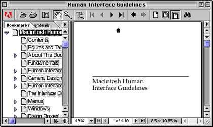
Acrobat 4
The first thing you are likely to notice is the toolbar. Like Microsoft Office, Acrobat seems to want to hide its buttons by making them flat—making them not look like buttons at all. Judge for yourself: even though the icons are largely unchanged, I think you’ll find that the buttons in Acrobat 3 are easier to distinguish. Further, it is easier to see their logical groupings. Buttons should look like buttons so that the user has an idea of what they will do before moving the mouse over them. (Indicating buttons by highlighting them only when the mouse moves over them violates the Macintosh principle of interface stability, besides being less efficient.)
At the left edge of the toolbar is a “grip strip.” The Macintosh uses these to indicate parts of objects that you can grab onto and move. The most obvious examples are window title bars, scroll bar thumbs, and the application menu in Mac OS 8.5. Alas, in Acrobat, dragging the grip strip does nothing—instead you must single-click it to “minimize” the toolbar. Isn’t this the behavior you’d expect from something that looks like a button?
Acrobat 4 has two Adobe interface elements with which Photoshop users will be familiar. First are the tabbed palettes that can be docked with the main window. These work well in Photoshop because it has a lot of palettes, and palettes are often preferable to layers of dialog boxes. In Acrobat, however, the palettes seem to add more confusion than they are worth. They’re certainly not standard Mac interface elements (they don’t even look like Mac OS tabs), and I found the three buttons that Acrobat 3 used for changing the view of the main window much easier to use and understand.
The other Adobeism is the heavy use of right-pointing triangular menus (seen at the top of each scr[!]ollbar) to present options. Again, this works well enough in Photoshop because the menus are attached to palettes and contain palette-specific commands. However, in Acrobat, commands that could perfectly well have been placed in the menubar (which, unlike Photoshop’s, is not ready to overflow) are instead hidden behind these triangles. Other commands that already are in the menus are duplicated in the triangle menus, presumably for convenience, although I have a hard time believing that this actually helps matters. Just as the toolbar buttons do not look much like buttons, the triangle menus do not look like they are pop-up menus.
While Acrobat 3 had commands for selecting text and graphics in the menubar, as well as buttons for them on the toolbar, Acrobat 4 banishes these important commands from the menubar and uses a single button for all the selection tools. To access any but the currently selected tool, you must recognize that the tiny triangle in the corner of the button means that you can click and hold to get a menu of other tools. Personally, I think the space used for the Adobe logo could be better used to display these three tools simultaneously.
![]()
One of my biggest complaints about Acrobat 4 is the way it handles the bookmark pane. The bookmarks take up much more space than in version 3, and they have weird dotted-line highlighting. Worst of all, they introduce a hidden mode, which is a big no-no in the Mac philosophy: depending on where you have clicked, the bookmark pane or the document pane can have the keyboard focus, and there is no visible way to tell which pane will scroll when you type an arrow key.
Finally, you’ll notice that Acrobat 4 adds more clutter to the bottom of the window. In fact, some of the new buttons there have counterparts both in the menubar and in the upper toolbar. I like programs that provide multiple ways to accomplish tasks, but this is a case where the extra confusion may not be worth it.
Contrast the above shot of Acrobat with page 162 of the HIG, and you will notice that it has more controls than even Apple’s example of what to avoid.

In Acrobat 3, the whole zoom level display was a pop-up menu from which you could easily change the magnification. In Acrobat 4, only the little triangle is a menu. The percent display is a weird text box that does not even select its contents when you click in it. The story for the page number display is the same.
“Whenever your application is in the background, hide all utility windows,” says page 162 of the Human Interface Guidelines, but Acrobat does not, and even worse, it lets the Close window command apply to some utility windows, but not others. There are other places where Acrobat violates Macintosh menu conventions. It puts Preferences in the File menu instead of Edit. Close is in the File menu, but Close All is in the Windows menu. And Show Clipboard is in the Windows menu instead of the Edit menu.
Acrobat Reader is not a terrible product. In fact, it’s quite useful, as you’ll find in a Jens Grabenstein’s review next month. (We would have put the review in this issue, but the Mac version of Acrobat Distiller does not seem to be ready yet.) But I think many people would benefit from Adobe spending a little more time making it Macintosh. One of the most important lessons the Macintosh taught the world is that computing can be fun. Many Macintosh applications stimulate one’s senses of creativity and curiosity. Their users are free to be creative and curious because they are not busy fighting the application. I’m grateful that Adobe has made a Mac version of Acrobat Reader, but whenever I try to use the product, it changes my whole frame of mind. Suddenly, I want to finish what I came there for and be done with it. No exploring. No tweaking. No fun. What a shame.
Bungie
Bungie is a cool company. Although Mac users certainly do not have as wide a selection of games to choose from as PC users, at least they get to play Bungie games, which are some of the best. Marathon and Myth from Bungie, and a couple of games from Ambrosia Software, are the only Mac games that I have seriously played. Bungie continues to make great games and release them simultaneously for Mac and PC. But somewhere along the line, they stopped doing some of the little touches that Mac users take for granted. A glaring oversight in my opinion is that Myth and Myth II do not support the Macintosh clipboard. That’s right, you can’t cut or paste text from the chat window, or even paste an IP address into the TCP/IP connect window. (Really, should any Mac user have to memorize or write down a twelve-digit IP address to play a network game?) Further, the standard arrow key navigation and selection commands don’t work in Bungie’s text boxes.
Style over Substance
There was a time when you could easily identify an application icon because it was diamond-shaped, contained a hand graphic, or both. Now, many developers eschew this convention, presumably because it lets them create spiffier icons. Is this a big deal? No. But it is an example of the Mac’s eroding consistency.
![]()
QuickTime Player & ImageReady
These are two examples of icons that look nice without conveying as much information as they should. Microsoft Internet Explorer is another example.
![]()
Myrmidon
Can you tell the file type of this icon? Unless you recognize that it belongs to Myrmidon, you’d probably assume it is an application like the two square icons above. In fact, it is a Chooser Extension.
![]()
QuickTime Music & MetroNub
These two, on the other hand, are nearly perfect. The interlocking backgrounds clearly identify them as system extensions. At the same time, the artists have managed to include graphics that are both easy to look at and communicative (the clef clearly indicates music, and the bug indicates that it has to do with debugging). Further, the companies were able provide information and advertise their brands—anyone familiar with Metrowerks will recognize their yellow-and-black striping, and the clock-Q is the new QuickTime logo. Thus, it is perfectly possible to create appealing and informative icons.
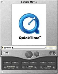
QuickTime is not all good, though. While I like the way the new QuickTime Player looks, I can’t help but feel that it is style over substance. The player window is easy enough to use, but does not behave the way other Mac windows do. It has no zoom box or window shade widget, and resizing is proportional by default—often what you want, but the reverse of the behavior in most Mac applications. What kind of example is Apple setting? Certainly, if every application developer made their own kinds of buttons and made their software work slightly differently, Macintosh software would not look or feel like Macintosh software. Interface consistency is one of the Mac’s greatest advantages, and it’s critical that developers prevent it from being eroded.
For Further Reading
Tog on Interface by Bruce Tognazzini
Macintosh Human Interface Guidelines by Apple Computer, Inc.
Tog on Software Design by Bruce Tognazzini
About Face: The Essentials of User Interface Design by Alan Cooper
Usability Engineering by Jakob Nielson
Mac OS 8 Human Interface Guidelines by Apple Computer, Inc.
![]() “The Personal Computing Paradigm” is copyright © 1999 by Michael Tsai, mtsai@atpm.com.
“The Personal Computing Paradigm” is copyright © 1999 by Michael Tsai, mtsai@atpm.com.
Also in This Series
- How Cool Is Your Mac? · May 2012
- Mac OS X’s Increasing Stability · August 2006
- Coping With Mac OS X’s Font Rendering · January 2006
- E-Mail Archiving with Eudora and Mail.app · January 2003
- Grab Bag · October 2002
- Mac OS X 10.2—First Impressions · September 2002
- Mac OS X 10.1—First Impressions · October 2001
- Mac OS X Tips · June 2001
- Mac OS X—Finally · May 2001
- Complete Archive
Reader Comments (1)
Add A Comment