About This Particular Outliner
Outliner User Interfaces
This month we look at different user interface strategies of outliners. If you came late to this movie, we are beginning a journey into the land of Mac outlining that began with a look at history, went to outliner features—a survey that took a second month. We reported two months ago on usage patterns.
Now we turn to how we interact with the outline itself. This is no small matter, my friends, because outliners may be the environment you spend your most creative time in—that time when the Mac is supposed to be special in understanding and supporting.
Good user interface details are like fresh air and bad ones are like a minor toothache you haven’t quite noticed yet. This is another of the several elements of outlining that depend on the user; that’s what makes this your particular outliner.
So in the spirit of our first columns, we’ll survey the various strategies and differences more or less without judgement so that you will know what to look for. However, this time we only cover Mac OS X outliners, avoiding the cross-platform Java and X11 ones.
History of the Disclosure Triangle
Pre-computer outlining relied on complex numbering schemes involving numbers and letters, Roman numerals or “dot-levels” (like section 1.2.5.23). This was all a bit hairy and not visually intuitive. Computers allowed child items to be indented, which was a novel innovation, sort of the “wheel” of outlining. With indentation, you can “see” the structure of the words without reading anything. It was marvelous, and that singular idea elevated computerized outlining beyond anything in the world of paper.
Collapsing was the next brilliant invention. As we noted in the history review, this first appeared in code editors. Those were the days (the 1970s) when coders were real men (usually men) who wrote monolithic programs of thousands of lines of code by themselves and without the handy modularizations common today. They needed collapsing and folding to manage the complex structure of the program.
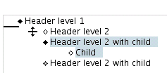
Exactly who developed the “plus-labels” is lost in decades-old history. With plus-labels you had a way of using characters from the standard font set—namely the plus and minus signs—to denote whether a heading had children or not. ThinkTank and its successor, MORE, brought this convention to desktop outlining.
The screenshot shows MORE in its final incarnation, which used all sorts of extra character-like symbols to provide additional information, as explained in the shot. MORE followed the already established convention: a plus sign meant that there were children under a header, and minus sign designated no children.
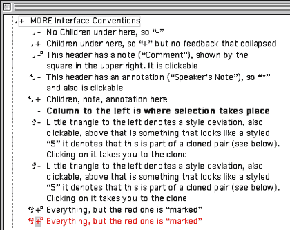
MORE
Unfortunately, this provided no feedback on whether a header was collapsed or not; you had to notice that a plus-marked header wasn’t displaying children. The Mac introduced the world of graphical user interfaces, but the Intel world remained stuck with character-based displays for years. Successive generations of Windows only gradually replaced DOS conventions so that even today Windows outliners keep that archaic plus label idea, even in their equivalent of the Finder.
But somewhere along the way—exactly where is lost in the ether—the conventions were mixed: in some outline views a plus means a header has children and is collapsed; a minus means that a header has been fully expanded. This at least gives you some indication of state.
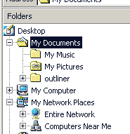
Windows Explorer
So strong is this plus-label convention that Microsoft even carries a graphic version of it into its latest word processor. The screenshot shows Word’s outliner, using the MORE convention of plus for headers with children, and minus for childless headers. Word gives feedback on collapsing by drawing a grey line where the collapsed stuff would be.
Word Outliner
Fortunately, we Mac users escaped that clumsy convention. Indeed, one of the main discriminators of Mac outliners versus their Windows counterparts is in the use of the disclosure triangle. ATPO has sent its Baker Street irregulars into the rubbish bins of Mac history and has discovered a large part of the reason why.
In 1983-4, David Carr wrote a pretty advanced “next generation” DOS database that had hyperlinking and rudimentary outlining. It was called Framework and like Lotus’s Agenda, never really caught on, and died when Windows came about. It was sold to Ashton-Tate, then Borland, and finally Selections and Functions, Inc.
Framework had a sort of outline view which used a triangle. David Dunham was inspired by that idea in designing the user interface for Acta shortly thereafter.
Actually, Framework is still supported! One imagines it controls some key military air traffic control infrastructure or something. You can see the very triangle in question at the Framework site. That triangle is not clickable and it does not rotate.
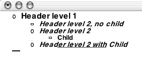
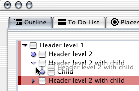
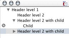
Acta’s implementation can still be used in Classic; the screenshot shows it. It is a marvelous invention; a turned arrow “opens” the children. A white arrow has no children. Clicking on the arrow collapses or expands. The world of outlining would never be the same…at least on the Mac.

Acta
That triangle became a fixed part of the Mac toolbox. Even Bruce Tognazzini, founder and director of Apple’s Human Interface Group, cannot remember when it crept into general use. You can see it all over the place in non-outlining contexts. The screenshots below show a recent Finder Get Info window and Word’s formatting palette.
Finder Info
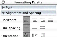
Word Formatting Palette
These triangles are called “disclosure triangles,” “flippy triangles,” or simply “outline triangles.” Two things happened to outline triangles on their way from there to here. The first is rather profound: in System 7, Apple introduced the “outline view” in the Finder. The Finder is just an application like any other, but nearly all of us think of our Macs in terms of the Finder. For us, the Finder is the basic identity of the system, and since 1990 outlining has been the basic identity of the Finder.
The second is that the triangle has evolved from a black right triangle with a point of 90 degrees to a grey equilateral one with all angles and sides equal. The old arrow was designed for use on a black and white screen. The screenshot enlarges one so you can see the black pixels clearly. Next to it is a modern outliner arrow, which you can see depends on the ability to select from more shades of grey.

Old and New Arrows
Several of the more mature (read: older) outliners still use 90-degree arrows: Frontier, Inspiration, Tinderbox, and Schedule. All of these are cross-platform (Tinderbox will be soon) and are unlikely to change. To be fair, Tinderbox and Schedule have been modernized. The screenshot shows the arrows from Schedule, Eudora, and Tinderbox from left to right.

Modernized Arrows
Collapsing Feedback
That little triangle—and indentation—is the fulcrum of outlining. But different outliners bring all sorts of innovation to how they advise on collapsing. In December we described jEdit. It is not a native OS X outliner, rather Java, so it has some interface quirks. But it is free and runs well on OS X. It indicates feedback on collapsed headers by darkening the background and also by telling you how many “lines” are collapsed. Since jEdit is designed as a code editor, “lines” are what writers would call paragraphs.
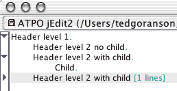
jEdit Collapsed Feedback
You’ve already seen how Word gives feedback on collapsing, by drawing a grey line. It is an elegant idea because it relates to the matter that is “window-shaded” up. AppleWorks has an outliner we haven’t talked much about. That’s because it is a different beast from Word’s; the AppleWorks outliner really exists to make outlines within documents rather than of documents. But it is interesting because it allows quite a few different labelling styles like bullets, several numbering styles, and a “diamond” mode. Oddly, it doesn’t offer an outlining triangle. Each labelling style has a different feedback mechanism for collapsing, always in the label.
AppleWorks Feedback
NoteBook maintains two outlines. One is a “page” that consists of an outline, and another of the notebook contents which is an outline of outlines. Both use “Aqua-fied” glass triangles, but different user interface conventions. In the regular outline, the triangle simply will not rotate to point right if there are no children. This is a unique approach. It makes sense but you have to get used to a triangle pointing down to nothing, something that is disconcertingly unintuitive.
The screenshot shows the outline-of-outlines behind. This has a different philosophy because that round bullet is a hyperlink that when clicked takes you to the page denoted. In this outline there are two citizens: pages and sections. Again, using some of the same user interface conventions but in a different way takes some getting used to.
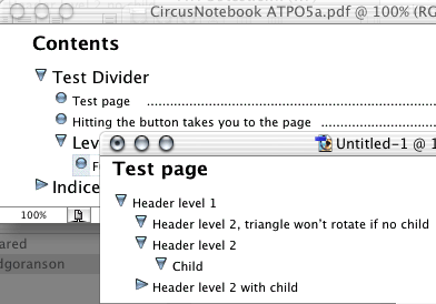
NoteBook
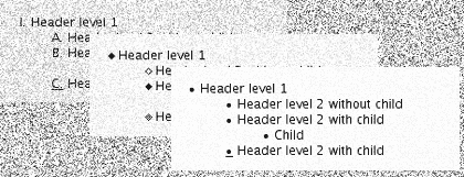
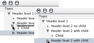
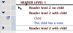
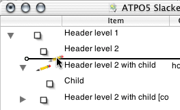
When we do our comparative review between NoteBook and NoteTaker, you’ll see how radically different they are. You can get a glimpse of this now in how NoteTaker handles “arrows.” The screenshot shows a part of an outline “page” in front. You’ll note that it doesn’t use arrows at all, but instead uses an “Aqua-fied” plus-label convention—not the “MORE” and Word version, but the Windows Explorer version where “plus” means a header is collapsed, “minus” means it could be but is not, and “blank” means it could not be collapsed.
I suppose this choice is because AquaMinds intends to port the product to Windows in 2004. The window behind on the right is NoteTaker’s contents outline. It is similar to NoteBook’s except for the plus-labels and the use of a diamond as the hotlink to the page. But NoteTaker has a drawer on the left that shows the same outline as a fast navigation tool. This one is based on the Mac Finder, but is oddly neutered: you cannot add or reorder headers here. It serves more like the navigation outline on the left of Acrobat Reader.
This outline-of-outlines drawer has another pane below which is not shown. It displays an even higher level: all the notebooks of a user. Thus, in one presentation, you can have three layers of outline, more or less integrated. Handy and cool featurewise, but the use of two radically different outline user interfaces is jarring.
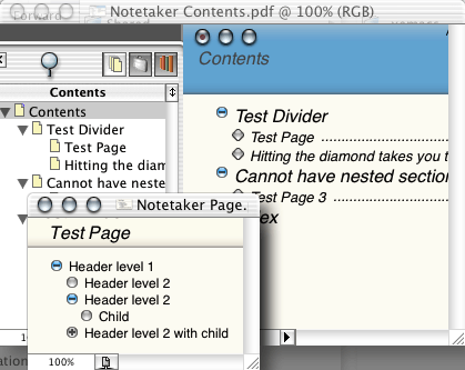
NoteTaker
Selection and Dragging
The nature of outlining is organizing and re-organizing. That means you are going to be moving things around, either demoting/promoting them or relocating them to another part of the document. In another column we’ll deal with automation in this regard. But here we are concerned with manual grabbing.
You’ll find a wide variety of approaches to selection and dragging. Generally, you need three “zones,” because you need to select the text of the header to edit or copy it; you need to select the whole header to relocate it; and you need to select some group of headers to move as a group.
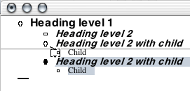
OmniOutliner exemplifies the cleanest approach to this. To grab a header, you simply grab the triangle and drag. To select a group, you just sweep the cursor to the left of the triangles. Look at the screenshot: the colored “gutter” to the left can be removed or changed. It emphasizes the structure. If a header has no children, it has no triangle. Dragging gives clear feedback, both on the position for dropping and in the translucent image of the dragged header.
OmniOutliner Selection
NoteBook and NoteTaker go one better. When they drag, they actually place a shadow the same size as the dragged item to show you precisely where it will go. NoteBook’s additionally shows the shape of the children’s indents.

NoteBook Drag
But not everyone works that way. Take Caboodle. In the screenshot, you’ll see that it has the good drag location feedback of OmniOutliner, but it needs a new interface element to “grab.”

Caboodle Dragging
Inspiration needs a special “selection column.” That’s the second column from the right. Actually it is unnecessary because you can click anywhere to the left of a header to select that header. In the screenshot, we have selected multiple headers.
Inspiration
Notes
That last screenshot brings us to the final major user interface widget we’ll look at this month: how to show notes. Only a few of the many OS X outliners even have this concept because you must support the feature we noted in the October column concerning two classes of text: headers and paragraphs (often called “notes” or “comments”).
Word, OmniOutliner, Tinderbox, and Inspiration support the notion in the straightforward way we mean. All of those have some indicator of notes. (In these outliners, it is also possible to have headers without notes.) Many of the “Finder-Note” type outliners (like Hog Bay Notebook and Skinkhunt Notes) have this distinction too, but in those outliners the “headers” are more like Finder names.
The previous screenshot shows Inspiration’s icon for notes, the little pencil/note icon. This supports elegant functionality because clicking on that note icon collapses the note under its parent header. In other words, the icon serves both as indicator of a note and that note’s “arrow.”
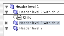
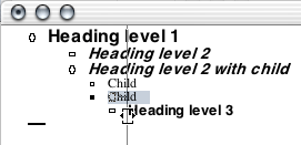
But the award for the most informative of note icons must go to Tinderbox. Take a look at the screenshot below. The rectangles indicate notes. Each note has a color, an important attribute that we’ll discuss in the review. Notice how some of the note icons have different numbers of lines? That is to indicate how much text there is in the note.
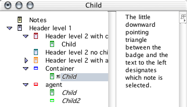
But wait. There are several other cool things. See how the header labeled “Container” has no text at all? That’s because it really is a container, like a folder. You can see that “Child” is cloned twice. I manually made a clone (an alias) and moved it to “Container.” But I also made a simple agent that automatically identifies and clones all notes with “Child” in their names. (There is a “Child2” hidden under the orange header that is also cloned.)
Note that the agent is designated as an agent by the thick bar being on the bottom of the rectangle instead of the top.
One final piece of Mac-like wonder: notice that all the icons but one are filled with grey. That’s because I just created them as “fresh” notes. But look at the first header labelled “Notes.” I made that one a month ago and it has a brownish tinge. Note icons turn tan as they age; now isn’t that cool?
Tinderbox
Okay, with that background, we’ll do a quick survey of all our OS X outliners.
AppleWorks
Several outline labels are supported, as already displayed above. These labels are hot and can be used to collapse and drag. Different methods are used to show feedback on collapsing, depending on the label method. The drag indicator is adequate but rudimentary as seen in the screenshot.
AppleWorks Drag
BrainForest Deluxe
BrainForest is a long-lived application, so it uses the old-style arrows. The arrows are not used for dragging. Instead, you can just select the header itself. This is very handy once you get used to it.
If a header has no children, it has no arrow. The screenshot shows a little dot. You either get that, or a checkbox that goes with some “action management” capabilities. Headers indicate notes with the icon to the right. In BrainForest’s case, a note is a sort of annotation on the to-do item.
The drag feedback is nice and clear so far as vertical position, but a little unclear on indentation.
BrainForest
Caboodle
Caboodle uses new-style conventions: modern triangles, no triangle if no children, and the Omni-style drag indicator. This seems to be the common standard for new outliners.
Unfortunately, it uses a green button as the drag handle. The good news is that Caboodle drags an image of the header as you can see from the screenshot above. This also seems to be the new standard.
ConceptDraw Project
This is a new product. You can see that it uses the older style triangles, probably in emulation of its competitor, Schedule. Alas, there is no way to select, drag, or rearrange through the graphical interface—or even from the keyboard.

ConceptDraw Project
Deep Notes
Deep Notes, which I remind you is free, uses all the modern conventions. Its drag indicator is of the OmniOutliner style, just like Caboodle’s. It carries a translucent image. It is unlike OmniOutliner and like BrainForest in the way you can select the header for dragging by just clicking on it.
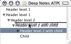
Deep Notes
• • •
By now, I assume you’ve discerned two patterns:
- That we are touching on the “arrow controls” and the “drag controls” with the feedback associated with both, and;
- That there are subtle differences among all these products, differences that could mean a lot to you.
We continue:
DEVONthink
Here is an example of an outliner that looks and behaves like many others. But look closely. The triangles are attached to every header regardless of whether there is a child or not. That way, you get no feedback on whether something is collapsed and invisible. This is the way the Finder works, by the way: you can “collapse” an empty folder.

DEVONthink
Look also at the drag feedback compared to the previous screenshot. Deep Notes uses the OmniOutliner method where a line shows position and a circle indicates the indentation level. DEVONthink has a different philosophy; it outlines the header that you are dropping into. This emulates the behavior of the pre-Panther Finder.
You decide which is better.
Frontier/Radio
Now here’s an interesting case. Frontier is from Dave Winer, the guy behind MORE, which we showed much earlier. MORE stuck to the plus-labels. Frontier finally adopts arrows, but it does so in the most limited way possible. Frontier’s arrows do not rotate; rather they change from grey to black when collapsed. All headers have arrows. A selected header is in reverse text with a black background.
This is a minimalist and elegant solution. The drag feedback is pretty interesting, too. When dragging, the cursor changes to a hand, giving feedback that a drag is underway. That blue arrow at the top shows what the part header would be if we dropped the dragged one. This is, I think, the only color used anywhere in Frontier. So the feedback is not so much tied to where you are, but where you might be placed. In this example, the two are pretty far from each other. The blue arrow can point southeast when the condition demands.
Frontier
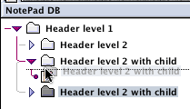
Hog Bay Notebook
More variations! Hog Bay’s Notebook uses a Finder-like metaphor. It has two classes of objects: folders and notes. It fixes the Finder feedback mechanism though. An empty folder has no arrow. The drag positioner is the familiar modern type. Hog Bay includes a trash can, which is a darn handy idea, for the same reason that the Finder’s Trash is.

Hog Bay Notebook
IdeaSpiral
IdeaSpiral almost doesn’t qualify as an outliner. It supports no mouse-driven reorganization of any kind; instead, a clumsy dialog is used. There is no collapsing.

IdeaSpiral
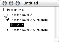
Inspiration
You’ve already seen Inspiration. It allows discontinuous selection, with the selection shown both in the gutter to the left and by outlines around the text. The cursor changes when dragging. The drop indicator is very clear. Also, it supports the very cool separate “collapser” for folding notes.
Life Balance
Once again, something different. This uses a round bullet when there is no child. You drag by grabbing the arrow or bullet. There is no explicit drop feedback in terms of a graphic. Instead, it uses a “snap” function, so that the dragged image jumps from one potential drop location to another.
Life Balance
Liner
Liner, on the other hand, does things somewhat differently. You grab the text, so you need no extra button for a header with no child. Life Balance is a Windows/Mac/Palm application, which explains why it stands out. Liner is Mac-only and looks like it.
Deviation from the Macintosh conventions (like Life Balance and Inspiration) could be a good thing if it is done intelligently and it fits the way you like your mind-eye dynamic to work.
Liner
Mathematica
We haven’t mentioned this one before because it costs nearly $2,000. Mathematica is a multipurpose environment for work in mathematics with unique strength in symbolic math. It uses a “notebook” interface consisting of “cells,” what we might thing of as paragraphs, but these cells can contain all sorts of things including the input, definition, and statement of any mathematical function.
Mathematica notebooks are one of the more flexible and innovative DTP environments ever created, regardless of the mathematics function. And a key innovation is the way you can nest cells in an outlining mode. The screenshot shows the unique way nesting and collapsing is displayed. The nesting is assigned and manipulated quite independent of the layout and indentation of the text on the page.
The screenshot shows our example headers only. Note that the last header is collapsed, denoted by the small triangle at the bottom of the bracket. The double tick marks at the top of each bracket indicate that it is a text cell.
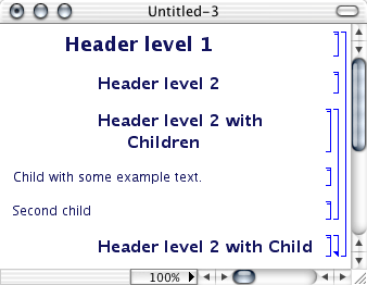
Mathematica
Mathematica exports to XML and is a potentially interesting partner to Tinderbox and/or OmniOutliner (and possibly Word 2004 for Mac if its XML handling is as improved as in Word 2004 for Windows).
MyMIND
This application focuses on the graphic view. The outline uses the common convention: grab the text, no triangle for childless headers, and the familiar drop indicator. Pretty competent donation-ware.

MyMind
NoteBook
We’ve displayed this above. Remember the unique drop feedback where the space and shape of the dropped items is displayed in context. Attention to detail here. NoteBook has an option to use “un-Aqua-fied,” “normal” grey triangles and bullets instead of those in our screenshot.
NotePad Deluxe
Now for something completely different. NotePad is from an exemplary Mac citizen, Ibrium, who is behind the open source Mac-on-Linux, a huge contribution to the community. NotePad Deluxe uses elements from all over, including Windows. As with Hog Bay Notebook, the Finder metaphor is used for headers with text as notes and headers without text as folders. You can drag from an icon or text but not an arrow. The vertical drop location is shown with a line. The left of the line changes according to the indentation of the drop candidate—not obvious, but with those connector lines between levels it is pretty elegant.
NotePad Deluxe
NotePod
This little application is also unique. It uses a hand dragger. The hand only grabs the “folder” or document icon. The drop location is indicated by a line. Notice that while the headers are indented the arrows are not. NotePod isn’t the only application that does this—you have already seen two others. It reflects a design decision to make the arrows a property of the window instead of being associated with the text. Empty folders have arrows.
I hope you appreciate the profound difference this might make to the way you think and work in the outline in addition to the efficiencies. Just look at the differences among NotePod, NotePad Deluxe, and Hog Bay Notebook. These compete with each other and have radically different interface paradigms.
NotePod
NoteTaker
You’ve already seen the fascinating approach this application has taken: aquafied plus-labels. You must drag from the buttons. The drop indicator is not a line but a box that indicates not only where the text will end up, but also displaces the headers around as they would be when the text is dropped.
Also, NoteTaker has a disconcerting mix of outline display paradigms. On the other hand, it makes some sense to show the Finder-like view in a Finder-like manner.
NovaMind
This application’s outliner function has a few deficiencies on the keyboard side.
It leaves a childless header arrowless. You grab the text. The drop indicator is the familiar line-circle variety.
NovaMind
OmniOutliner
This popular outliner substitutes a bullet for an arrow when the header is childless. When the header has text, a “note” icon is displayed. Clicking that note icon does nothing at all, however. In this application, you drag by the arrow or bullet. The drop indicator is the one we have seen many times.
Incidentally, OmniOutliner has an inspector palette with disclosure triangles. They are subtly different from their outlining triangles. Clunkier. Something better is promised in an immediately forthcoming version.

OmniOutliner Inspector
We’ll go quickly now.
Schedule
Since Schedule uses columns so heavily, it can limit its drag indicator to the sparse one shown. That second column is for dragging only. Odd, huh?
Schedule
Slacker ToDo Lists
Slacker selects and drags by the icon. Notice that only the icon’s image is dragged. The icon in this case is Slacker’s symbol for a header with a note attached.
Slacker
Tinderbox
You’ve already seen the amazing job Tinderbox has done with its notes indicator. One final comment: Tinderbox uses those icons as the hotspot for useful special contexts on the contextual pop-up menus. Even the small grey “selected” icon has a contextual identity.
Microsoft Word
Word’s outliner is surely the most widely used. We’ve already mentioned how it uses the plus/minus-labels. We’ll just note the interesting and quirky drop locator it has developed. You grab a header by its icon, then the cursor turns into a box with an arrow at top and bottom.
In some cases, the drop indicator is a horizontal line and in others a horizontal one. You can see the logic about which is displayed if you play with it a bit, but that logic doesn’t “read” well in use, even to an experienced user.
Word’s Horizontal Dragline
Word’s Vertical Dragline
My Own Personal Preferences
The user interface elements surveyed here are only a small part of the outliner experience, and we’ve ignored essential elements like selecting and dragging sets of headers. But outlines are a graphical arrangement of text, and these elements are at the core of the eye-hand interaction with that organization. That’s so even if you never touch the mouse. Selecting a specific philosophy is important because the Zen of outlining is in naturally attuning your thoughts to the way they are displayed.
I hesitate to give my own preferences. The differences among offerings and philosophies have been presented in this lengthy way so that you can select your own particular outliner.
Here goes for myself—
I think arrows should be used, and as a matter of consistency they should look like the Finder arrows. I have a strong preference for the arrows being associated with the header, in other words: indented with the text instead of being part of the window or in columns.
That association should continue further with the arrow being the grabbable element rather than the text. Part of the reason for this is that if the text is grabbable, you need to go through extra steps to enter the text field of a header for editing. OmniOutliner is an example of the several outliners that do this the way I prefer.
Contrary to how the Finder handles arrows, they should not apply to a childless header. That solution takes care of collapsed feedback nicely—if you have a right-facing arrow, something is always folded underneath.
I want to see as much information in the label icon(s) as possible. MORE did a good job at this, and Tinderbox is the clear exemplar now.
Grabbing for me should look like Cocoa dragging: an image of the dragged text should be stuck to the cursor.
The drop location indicator should tell me as much information as possible. Currently, NoteBook’s is by far the best.
These are my notions. I hope I have given you enough information to discover your own.
Department of Corrections, Apologies, and Additions
An unfortunate combination of events prevented this edition of ATPO from appearing last month as intended. My apologies.
At Macworld Expo, Microsoft announced Office 2004 for the Mac. It will include a separate outliner called “Notebook,” which looks alarmingly like the Circusponies and AquaMinds products. On the Windows side Microsoft has taken a completely different approach, offering—as a separate $200 product—OneNote, a freeform sketchpad that includes the most rudimentary of outliners. We’ll report on Microsoft Notebook as details emerge.
In my listing of to-do list managers last month, I somehow overlooked Life Balance, an interesting task management system that uses the outline paradigm and syncs with a Palm version.
The outliners keep coming! Check out the just released 0.9 beta for the newcomer FO, which has some unique and interesting features.
Also, in discussing columns in previous articles, I failed to mention that the donationware MyMind supports columns. Sorry.
Next month is the very ambitious survey of “legacy” outliners. If you have something to contribute or suggest, please message me privately.
![]() Copyright © 2004 Ted Goranson,
tgoranson@atpm.com. Ted Goranson has been thirty years in the visualization and model abstraction field, and has had careers in defense and intelligence spook labs. He is now beginning a new user interface project.
Copyright © 2004 Ted Goranson,
tgoranson@atpm.com. Ted Goranson has been thirty years in the visualization and model abstraction field, and has had careers in defense and intelligence spook labs. He is now beginning a new user interface project.
Also in This Series
- A Progress Report · February 2008
- Some Perspectives on the Worldwide Developers Conference · July 2007
- Writing Environments, Plus Two New Outliners · November 2006
- Examining New Business Models · September 2006
- Outlining Interface Futures · July 2006
- Outlining Workflows and ConceptDraw · May 2006
- Dossier and Outliner Web Interaction · March 2006
- Two New Outliners: Mori and iKnow & Manage · February 2006
- Styles Revisited, Video Features, and a Proposal · December 2005
- Complete Archive
Reader Comments (28)
Lotus adopted it for their email/groupware product, Lotus Notes, which is available for both PC and Mac.
But Lotus call disclosure triangles a 'twisty' or 'twisties'.
In Notes, the twisty is used to show/hide a section in an email. It can be coloured and titled as well.
Regards
it occurs to me there's another paradigm for displaying hierarchical information -- "column view".. this might seem too limiting for general outliner use, but take a look at Path Finder -- it supports simultaneous disclosure triangles and column view (and fixes the Finder issue of triangles on empty folders).. i think the key advantages are
1) allows perusal of a level's contents without disclosure of the next level pushing most of the previous level's contents out of view
2) allows descending two branches of the hierarchy simultaneously while keeping each within view of the other
3) helps keep context when traversing deep hierarchies
a "crumb trail" is another interesting feature for hierarchical navigation.. Path Finder has one (called the "Path Navigator").. it shows at a glance the current hierarchical position, and acts as a drag target too.. in list view (more like a traditional outline), the crumb trail acts as a hoist control
since you were discussing how dragging operates, one might also consider "spring-loaded" behaviors -- OmniOutliner does them nicely when the drag target is collapsed.. and of course Finder has them (at least in column view; in list view the behavior is "pop-up window").. in Path Finder, spring loaded folders in list view effectively "hoist" the target folder, and in column view they shift the view locus within the current window (which i rather like).. i think these behaviors are worth considering for text-oriented oultiners
The holy grail of writers.
I own licenses for ideaSpiral, ZWrite, Omni Outliner, Inspiration, and have tried many more.
Omni Outliner is pretty damned close. I just wish it had a Palm Conduit.
http://demo.weboutliner.com/weboutliner
ShadowPlan outliner -- for PDAs, plus desktop application available for Windows, Mac, Unix, Linux.
I am not sure I understand. It seems you want an outliner that imports items without drag or cut and paste. Further, you wish a note to be created with a corresponding new header in the outline.
OmniOutliner does not support this, though I'm sure you could find someone on their email list who would write an AppleScript for you.
However, there are lots of outliners that do this by services and other means. The most popular are DEVONthink, Circusponies NoteBook, AquaMinds NoteTaker, Hog Bay Notebook, and Skinkhunt Notes. There are others as well. Should we write a column on this?
On the other hand, your question may be different. If you are asking how to type new notes in OO so that you can edit them, then you have to create an outline header in the top pane before entering text in the bottom pane.
--Ted Goranson
I've outlined in both Word and Appleworks. I would argue that any outline OF a document would be necessarily contained WITHIN a document.
Considering the amount of effort you've put into "stretching" some of the other (clearly) non-outlining apps (ie email clients and Keynote) into outlining service in your previous installments, I'm surprised at how little you've discussed Appleworks. It's a disservice to your readers (especially when you mention the "W" app in a predominantly Mac article).
Five facts about Appleworks that should not be overlooked (besides the fact that it can, in fact, outline):
1. It is pure Apple/Mac.
2. It comes with most Macs (ie Free).
3. It is a single-pane outliner. (In a previous installment, the author only knew of two single-pane outliners: Inspiration and Word).
4. It supports named styles. (In a previous installement, the author notes that only Word supports named styles).
5. It supports a reasonable number of import/export formats. (Including Word and HTML).
These facts alone make it worthy, in my opinion, of greater attention than it has received so far in this column.
Great series! I look forward to the NoteTaker/NoteBook Showdown..
But I stand by my characterization. AW is not an outliner designed to outline a document like the ones I mentioned (and next month will survey with FullWrite and WordPerfect). In those, you can use the outline functions as a skeleton to progressively "fill out" an entire document. When finished, you can then remove the outline functions (labels and -- importantly -- indents) and be left with an "ordinary" document.
AppleWorks' outline function is designed to create internal outlines as part of a document, just like it and others support lists and tables. You cannot remove the indents in AW. I suppose you could write a long document in it as you could in any of the ones we've surveyed -- and you would have named styles in a single pane. But in that case, unless I am mistaken you would never be able to end up with a document rather than an outline even by exporting.
Note that in the styles, document headers are different than outline headers. I think this shows the intent of the designers. It makes outlines in a document, not of one.
That's why it was overlooked earlier. I noted it in this month's column because of the curiously and uniquely un-Mac like way it handles labels.
Best, Ted
Ted Goranson
The article shows screen shot of MORE "in its final incarnation" if one selects those + or - "Leaders" as the way to display the outline. The implication is that MORE only uses these "Leaders" for formatting an outline.
MORE provides five other means to automatically generate the format of the outline (No Labels, Harvard, Numeric, Legal, Bullets). In addition you can customize the way your outline looks in less than one minute, by combining labels or by using different labels that you pick (e.g., hyphen).
I find the "Leaders" format is really confusing. My standard outline primarily uses No Labels for the lead item and hyphens (Custom selection) for all the nested items. It looks pretty much like a standard Word document in its final form.
The article states MORE "provided no feedback on whether a header was collapsed or not." This is only true in "leader" format. On all other formats other than "leaders", MORE shows a small arrow on collapsed headings.
This column was about OS X outliner conventions, with MORE mentioned only because of how it advanced the meme of plus labels. Next month we'll mention MORE and other legacy outliners more properly. Message me privately if you (or anyone else) would like to help.
Best, Ted
1. It's the only outliner whose design and features were entirely metaphor-driven - the metaphor in this case being a distinctive outlining technique long established in screenwriting but largely unknown elsewhere: the use of 3 x 5 index cards on a corkboard. Traditionally each scene is outlined on a separate card, and the structure of the screenplay is developed by arranging old and new scene cards on a corkboard with map pins. (David Lynch's old screenwriting teacher once revealed that Lynch still uses a technique of film construction he taught: you save ideas for scenes on 3 x 5 cards, and when you've got 60 cards in your deck you've got a movie. Once you know this, Lynch films look quite different.) The software implementation (by screenwriting-software specialist Ben Cahan, who also wrote Final Draft and Collaborator) took this basic metaphor and added features on the basis of thoughful consideration of what a software implementation could add: an outline pane (actually a separate window, dynamically linked to the corkboard window); Inspiration-type hierarchical relationships between cards, which could be shown graphically with tree-connection lines on the screen and could be collapsed and expanded or rearranged in different orientations; ability to resize cards and collapse a card to its headline; a zoom window for reading cards in very large and complex screen layouts where the virtual corkboard was too small to resolve individual cards.
2. Simply as an outliner, its distinctive features were (i) what I think was the first implementation of a two-pane view, with separate windows for the outline and corkboard view dynamically linked so that changes in one would be immediately updated in the other; (ii) a 2D view in which all headers' notes/body/comment text could be seen (or collapsed), rather than just one at a time (as in Inspiration) or none (as in MORE).
I always thought 3x5 had great potential that was never quite developed, though in fairness I should say that I never did upgrade to the final release version; in the end I found Inspiration and MORE did enough of what I wanted between them, and indeed it's the only outliner I've ever successfully abandoned. It always felt a bit unfinished, with limited and buggy import/export options, and in practice it needed a lot of screen real estate and was still quite clumsy to use. Eventually the standalone product was discontinued and a very cut-down version integrated into Final Draft, where it still survives after a fashion - but from what I've seen from playing with Final Draft demos, it's no longer readily usable as a general-purpose outliner. It's a great shame, because there was a moment when it really did look like the future of outlining.
TakeNote! is an excellent application, unfortunately not at present updated to OS X. You view in 2 panes any 2 of 3 elements: an outline, notecards and reference cards. But you can't move the notecards around, which was the great thing about real note cards and Three by Five.
Perhaps one could make notecards in Inspiration? Could they be used as flexibly?
Any chance of a grid for interchangeability of content among outliners?
You could come up with a small standard outline document, put it up here, and ask people to Import it into whatever they use -- and make one specific change, then Export it to (whatever)
And -- uh, I dunno, maybe post the results as an image or PDF file to see what happens to the content?
Because -- outliners are wonderful but they're black holes for content (unless Dave Winer has his web based tool working somewhere, and i sure can't find it).
A shared work outlining tool -- whether competent exchange among programs, or an online app that would serve as a common denominator for various outline forms -- would be instrumental.
I'm not willing to drag ATPO readers through the frustrations of OPML exchange. OPML was created for a specific, limited purpose and may have already outlived its usefulness -- at least for anything users of such a standard would need.
What we need is a NEW xml-based exchange standard. Maybe we can use the immense influence of ATPO (!) to describe such a standard. Would a column just on this matter be of interest?
Best, Ted
I'm desparate! I just bought a MacBook Pro w/Leopard on it only to discover that AppleWorks doesn't work!
I have done everything that I have read on the Web. My dictionaries aren't being recognized.
I have literally thousands of outlines with custom formatting. I am cringing at the thought of having to convert all of those files and losing the hours of labor it took to create them.
What software would you recommend?
Gosh, I wish I had a magic bullet.I just don't know what to do with this.
If it were me, I think I would do something expensive, like going to classic, jumping from what you have to Framemaker SGML, which I think can be done. Then once in SGML/XML, using their export tool to target whatever new outliner you prefer.
Write us and tell us what you did.
--Ted
I'm still using ShadowPlan on my Palm OS 4.1 Clie SJ30 in my botany/restoration field work.
Everything I use seems to need an outliner-view that would work seamlessly to exchange files.
I want to be able to view my Firefox bookmark collection in outline view, and organize them.
I want to make the labels I create for my botany field work photographs usable in outline form (with links to the images).
Etcetera, etcetera.
Is this just a way of thinking about/viewing/organizing the world that's done by only relatively few people?
I recall reading about the "House of Memory" method of recalling information (imagine a large house/castle, imagine each room holds some of what you want, imagine each room has places for storing each idea ...) -- from before the invention of movable type.
That was an outline format.
Where'd it go??
Great to be reminded of this series - in whose last instalment, nearly two years ago, Ted called for "a revolution in user interfaces, adding more advanced outliner-specific capabilities." Over the last couple of days I've been playing with getting MORE files into the extraordinary Headspace for iPhone. (Surprisingly, this can be done: it's a three-step process involving Brad Pettit's MOREtoXML, then a text-conversion macro to rewrite the XML tags for Freemind, and then importing to Headspace over wifi.) Headspace really is a tremendously new, interesting, and different experience in outlining: combining the familiar outline and mindmap models in an unfamiliar way, with hierarchical outlines as objects in a non-hierarchical web; collapsing outlines in 3D (so that the next level is visible behind and through the header); animating link navigation so that you very coolly ride along them inside the view; and above all allowing radical 3D manipulation of the view so that you can rotate 360 degrees on any or all axes, and view your outline from all angles and perspectives, including upside-down and behind. It's so unlike anything before it that you kind of stare at it like a lunar monolith or a bone going up into the sky and think now that you're master of the world you're not sure what to do next. But you'll think of something.
Add A Comment